My little blog is officially 2 today! So to my faithful readers: Thanks for reading!
A lot has happened in the last 2 years and I have been very fortunate to have a supportive family and friends while I try out new things, write this blog and take on more clients. To my family and friends: Thanks and love you all!
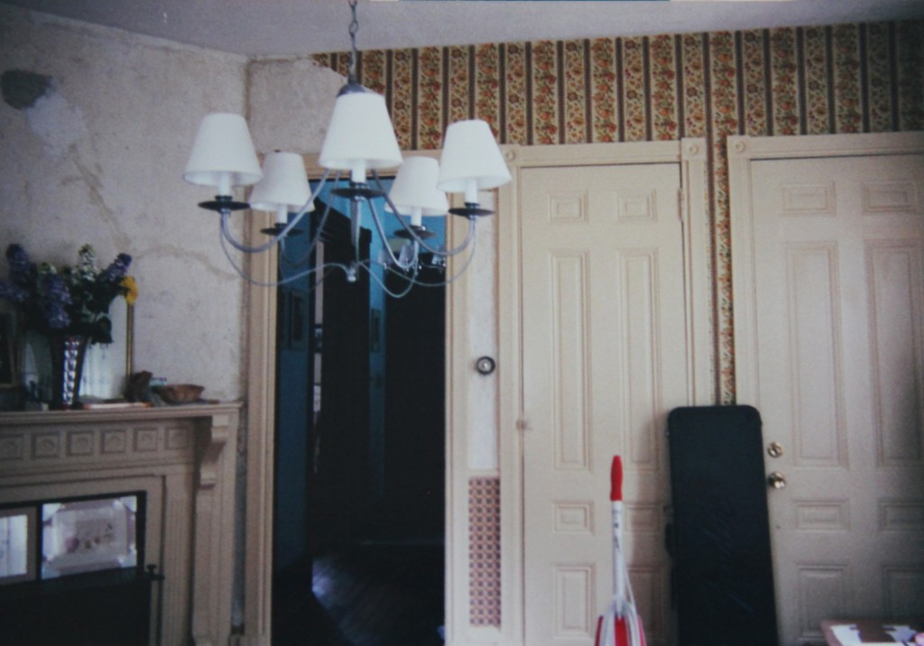
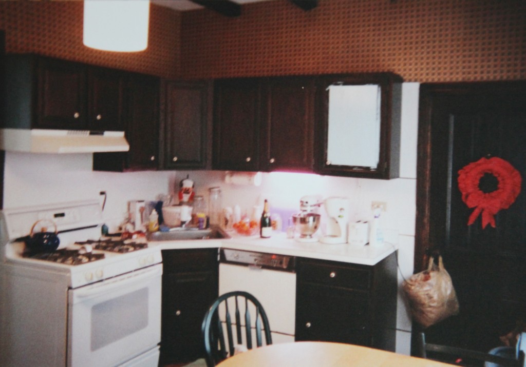
I am still working on a full house tour, but today I thought I would show you some before pictures of our house (aka 2000 when I didn’t know any better). I finally dug out some of the old photos and took photos of them (yes, photos of photos) so you too could enjoy the splendor of the 1970s wallpaper and color schemes too! And, yes clearly we were crazy!
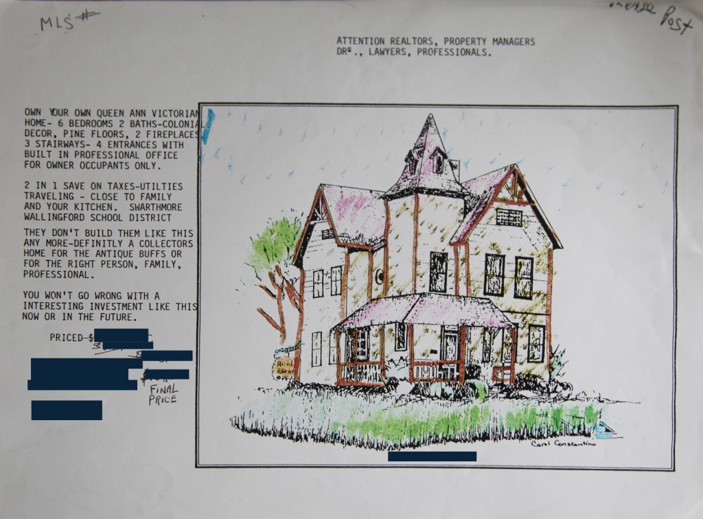
Above is the flyer that was handed out at the open house. I removed the price but I will say that the price was lowered 3 times and was pretty reasonable (although I suppose if you factor in the work required maybe not so much). It was well under our budget and over $50,000 less than the original price. I don’t think we were the “antique buffs” the previous owner was thinking of but we do LOVE our house.
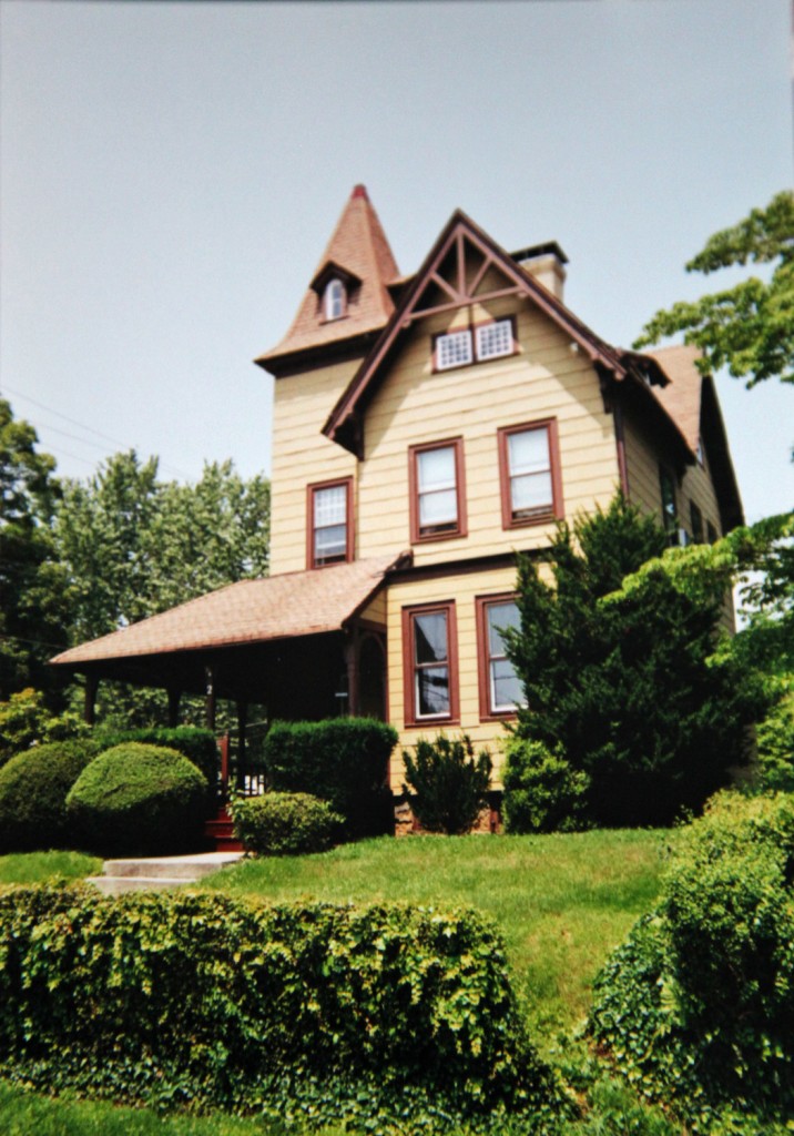
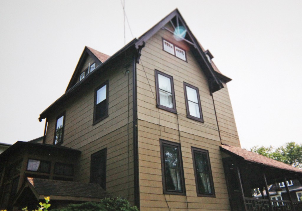
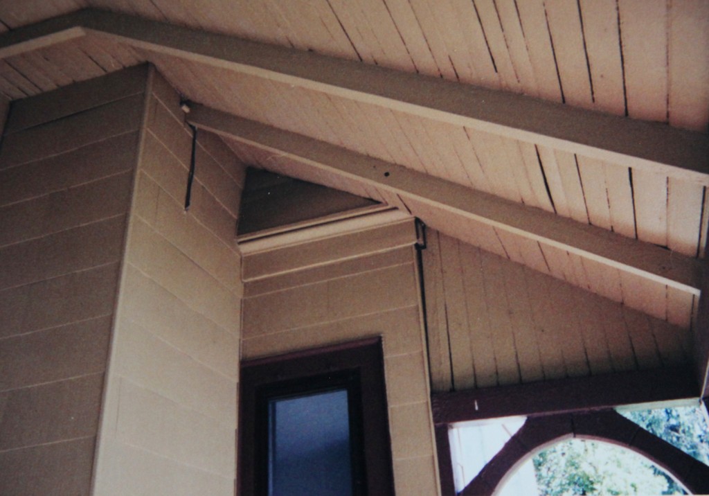
This set of exterior photos are from the open house. I hope you enjoy the mustard asbestos shingles in all their glory (since thankfully they are all gone). Mr. S. is most amazed by our little privet hedge covered in ivy. One of my early jobs was spending many hours cutting out the ivy. The hedge is now 3 times as tall and wide (with some very stubborn ivy still there).
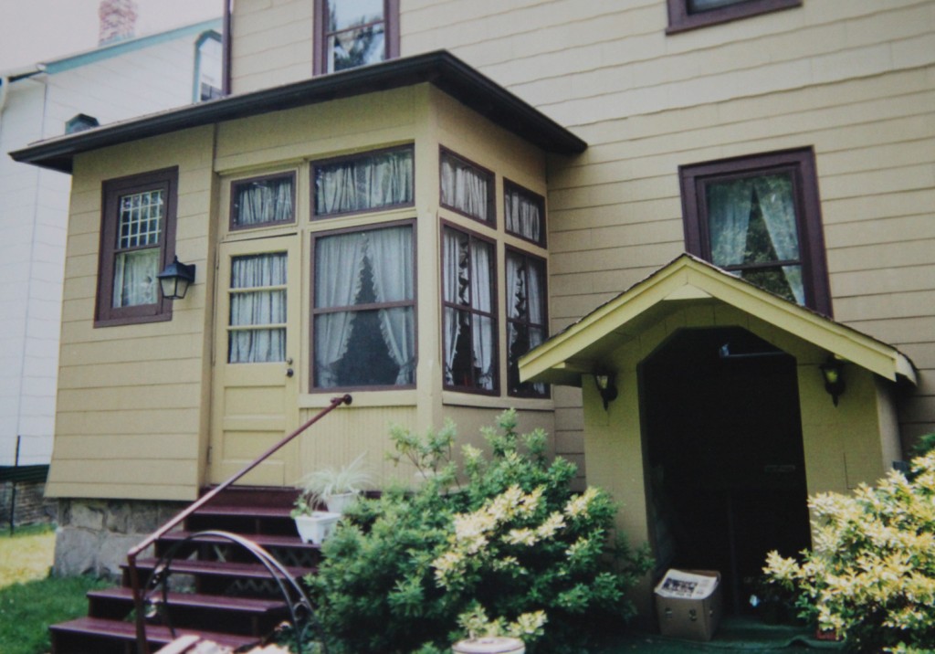
Here is the back of the house with the “entrance” to the basement office. I was so happy the day we took that off since it was blocking our view of the backyard (in what was the dining room and is now the kitchen). One interesting fact is that the entrance was made completely out of old Boeing crates (the previous owner worked there). The window on the left is now where the piano is located but was behind the fridge when we bought the house.
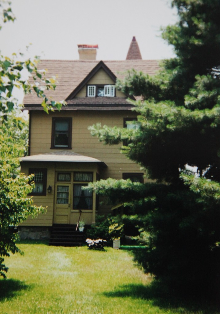
A straight on view of the back of the house. One of the things that sold us was the giant pine tree.
In this shot you can see the bulge in the siding (which we were very curious about). When removing the siding we realized that it was because the first floor was covered with fake brick in between the original shingles and the asbestos ones.
Just look at all that mustard! It was everywhere (well except for the brown trim)!
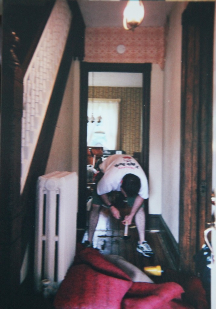
Please step inside! I don’t think we actually have a picture of the front hall from before we bought the house. Here is Mr. S. about a week after we bought the house taking out the red carpeting and wallpaper from the front hall. Fortunately at least the wallpaper came off easily (at least in this space).
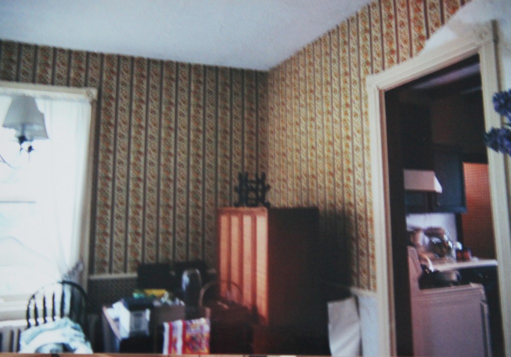
Next up is the old Dining Room which is now the Kitchen. We had already replaced the light fixture in here. The first time we painted this space I went will a pretty bright light green. Later I thought that decision was a little too bright and primary, but when you are going from an endless see of 1970s gold, orange and brown gloom, all I could think of were happy bright colors.
This is looking back towards the front of the house. The middle door is no longer there (it has been replaced with a door in the hallway for the half bath). You can also see the corner of the wood burning stove sticking out from the fireplace. That was a beast!
Finally I am going to leave you will a before picture of our kitchen (now the Dining Room). And yes, that is all the counter space we had! The door on the right lead out to the refrigerator room. You can also just get a glimpse of the faux wood “rustic” beams that were on the ceiling. The light blue on the cabinet was my test color. We lived with this kitchen for a couple of years before making a much more suitable space in the Dining Room.
I will be back next week with some more before and after photos! We will be celebrating our little one’s birthday this weekend.




I’ve enjoyed following along on all of your projects over the last two years. Thanks for sharing with us through Stately Kitsch, and congratulations! These old house photos are a fantastic testament to your vision and the sweat equity you’ve invested in your lovely home.
Thanks Stacey for being one of my first supporters! 🙂
Oh my god, I SWOONED when I saw the flier from the open house! I love that they have a hand drawing rather than a photograph. Do you think they did that because it’s charming or because they worried the mustard overload may scare off potential buyers?? So glad you snapped up this gem of a house and have made it your own. Congrats on 2 years and have a good birthday weekend!
Katie thanks! Yes, the flyer is pretty good. The house was on the market for almost 2 years when we bought it. I can only imagine where the previous owner hung it during that time (it had a note “please post” on it). I would imagine that the sketch was perceived as more charming then the actual house. I also like that the artist signed it!
Happy Anniversary! So great to see the Befores and the awesome flyer. We did the same with our house… pulled out carpet and ripped down wallpaper as soon as we got our keys! Happy birthday to your littlest little one. Wishing you many more blogging years ahead. xo.
One of my biggest regrets is how few photos I took … it wasn’t really until I started blogging that I realized HOW much I had failed to document. Part of that is how you move in and are overwhelmed by boxes/mess/disaster… but also, I didn’t really understand that THAT was what I needed to be taking pictures of. It’s not really obvious to take pictures of ugliness… and I think I was waiting for it to look “better.â€
Your house doesn’t look remotely the same. If you put your before-exterior photo next to your current, I wouldn’t know they were the same house.
Happy Blog Birthday!!
Thanks Victoria! I’m still not quite sure why we decided on our house. Part of the factor was that is was in our price range, in a good school district, walkable to the train station, “livable” and not tiny. There were also little hints of the good bones and a tower.
The photos are definitely a problem. Of course when we started we were still shooting with actual film, so it was a much bigger pain to actually take photos. Even now, I have to remember to go shoot before and during shots (which are often at the last minute).