Archives For -Kitchen

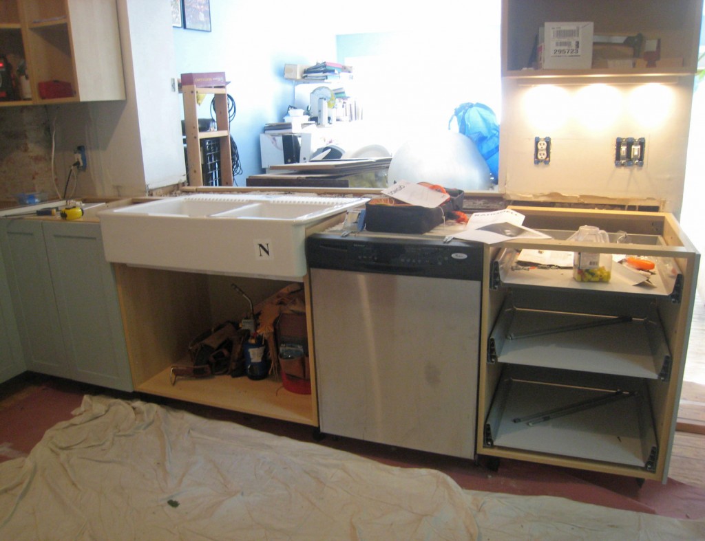
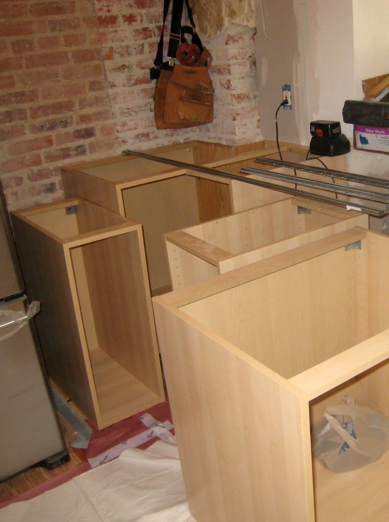
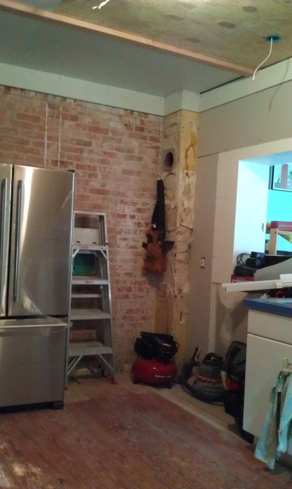
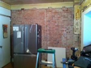
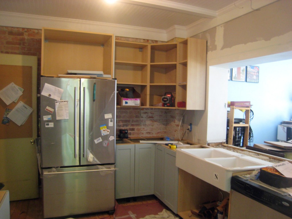
East & South Walls w/ Sink Temporarily Placed. The fridge is now in its final location (which involved chiseling out the brick to fit an electrical box). Originally they had installed the box in the base of the adjacent cabinet but there wasn't enough clearance for the plug. It is interesting that Ikea designed the fridge to be that super tight in the opening. It will look nice when it is done but it will be a pain to pull out.

I just have to start out by saying aren’t the cabinet doors/drawers a beautiful color (it is Benjamin Moore Wedgewood Gray)! I stopped by Andi and Neil’s house yesterday afternoon to see how things were progressing and it was very exciting to see some finished faces on the cabinets!

The counters are scheduled to be templated today! That means that all of the bottom cabinets are in and ready to go! The sink has been temporarily placed (it sits on the counter so it can’t be installed until after the counter). We opened the box that the range is sitting in, since their will be a small piece of counter behind it because it is a slide in range (it has a lip on 3 sides that sit on the counter to provide a seamless look). Once the counters are templated the fabricator takes this information back to the shop for final fabrication. This usually takes 1-2 weeks. Fingers crossed they will be on the shorter side of this. The actual install of the counter is usually quite quick. When we had our counters installed it took them 2 hours tops.

The contractor also installed one of the under counter lights to see how they look. One weird thing about the Ikea undercabinet lights. They are designed to use a cord and plug and not be hardwired. That is really strange to me since most people would be hardwiring in a new kitchen. We also have to figure out if the trim for below the upper cabinet (to hide the lights) has a special Ikea clip (fingers crossed) to make the install easier.

South Wall w/ first under cabinet light installed. The last 3 drawer fronts still need to go on for counter templating. They have also adjusted the blocking in the opening to the sunroom so that the counter can span that area

West Wall w/ new wall cabinet notched out for the radiator pipe

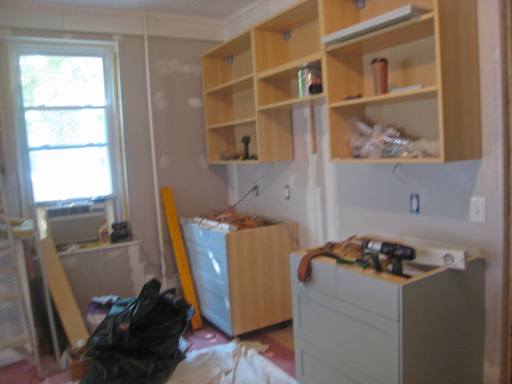
North Wall w/ the beautiful new drawer units (range and microwave to be installed in between)

Close up of Painted Drawer Unit. Isn't the color beautiful!

2 Comments

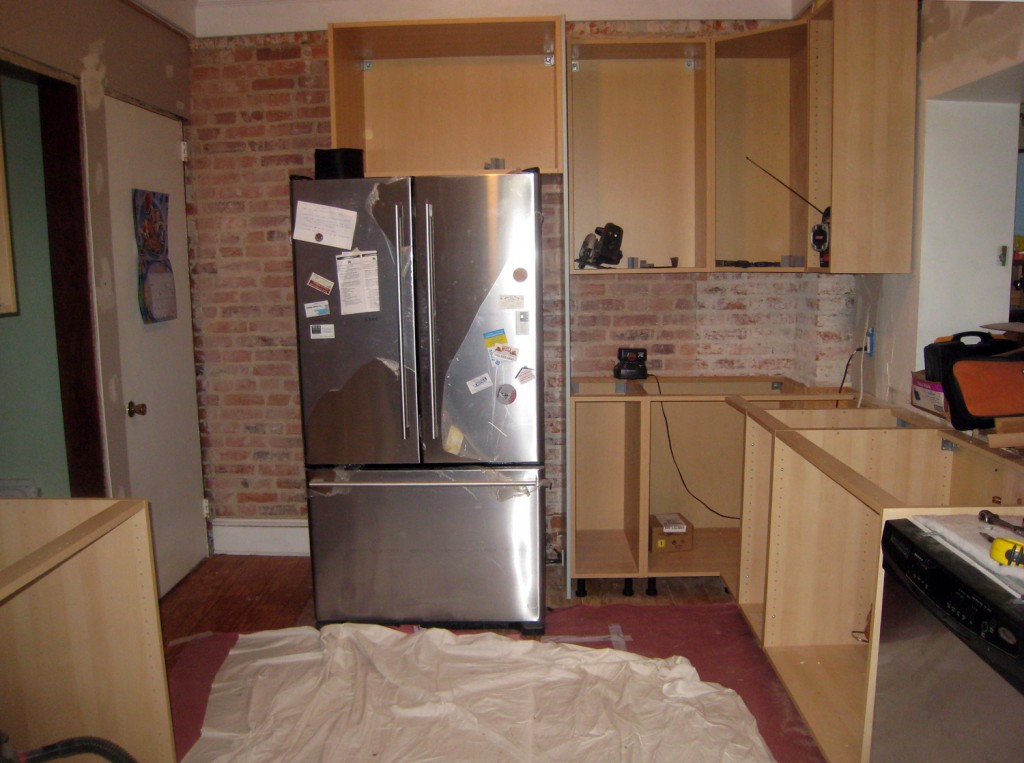
East Wall w/ cabinet boxes installed (fridge has not been pushed into final location). I like how the brick looks as a backsplash.

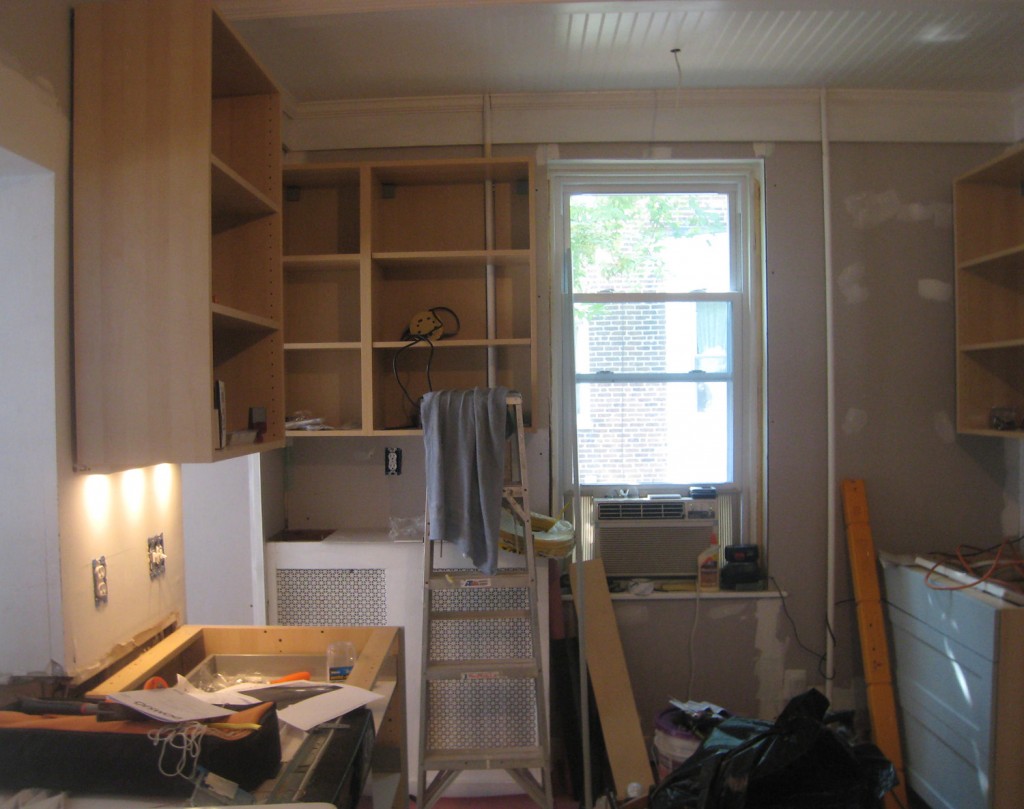
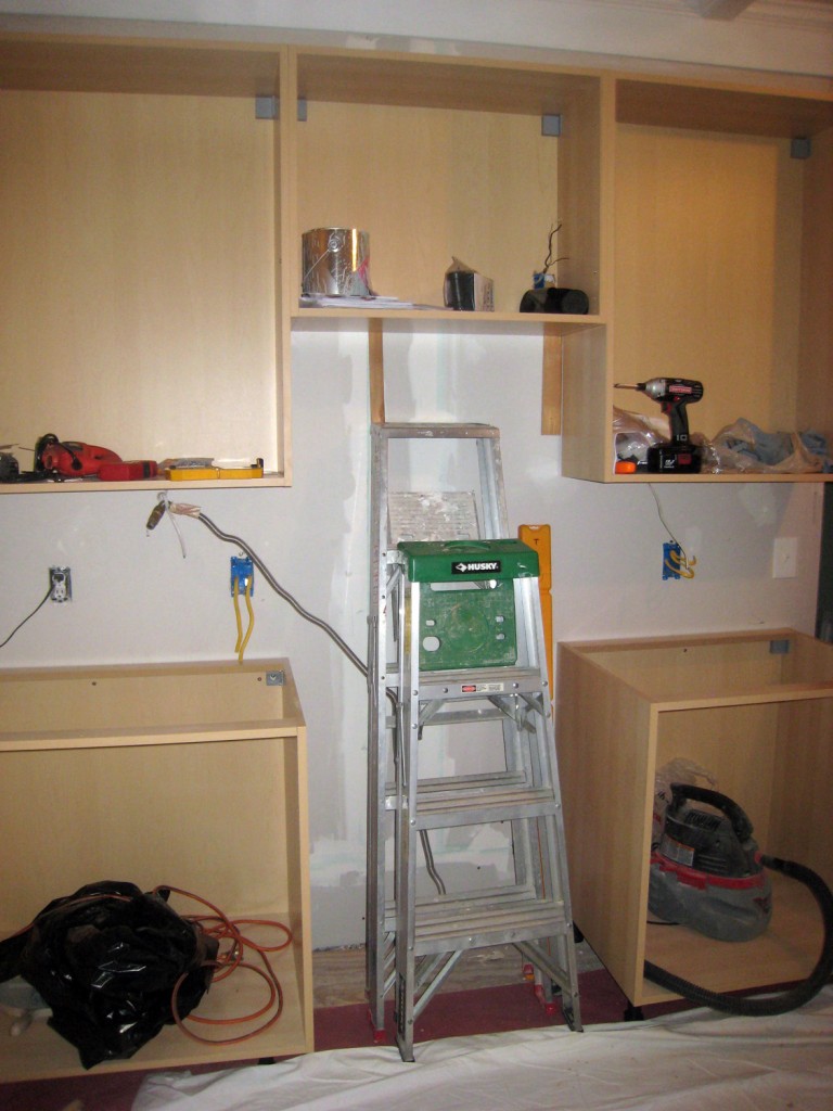
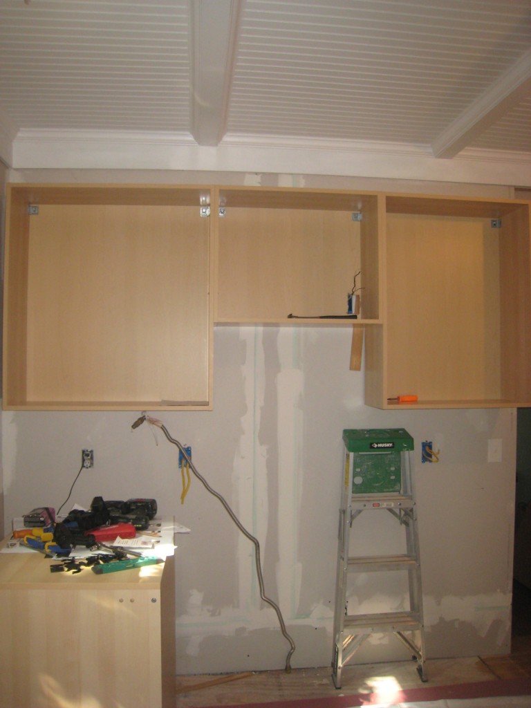
North Wall (microwave and range to be installed where ladder is located)

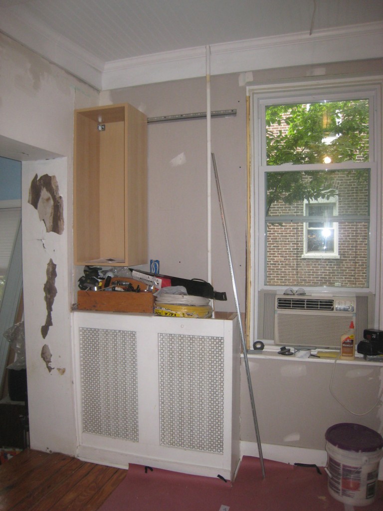
West Wall w/ first upper cabinet installed (the cabinet will be raised several inches)

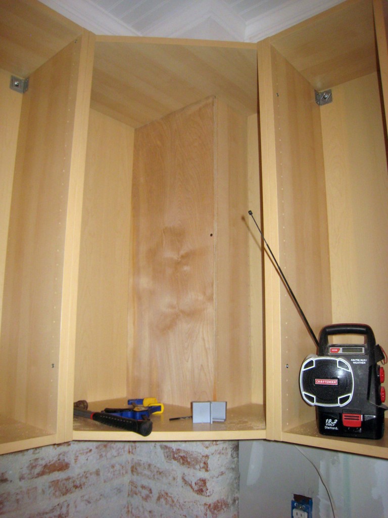
Upper Cabinet at the Chimney (fortunately there is still quite a bit of space left after cutting for the chimney)

I stopped by Andi and Neil’s house yesterday afternoon to see how everything was going. The contractors are almost done installing the boxes. The plumbing for the sink is roughed in. The panel on the side of fridge and its new electrical box are installed. The cutting and patching for the upper and lower cabinets at the chimney is finished. It is exciting to be able to see the new layout! I think it will work well for them. Andi is already planning out where to put all of their stuff! There is still quite a bit left to do and I think the project has officially gone from “I can’t believe I am getting a new kitchen excitement”  to “when can I have my kitchen back”. I tell my clients at this point to try and hold it together, a month from now this will be a distance memory! It is a pain to live through a kitchen renovation, and at times it seems like it will never end, but fortunately it does. : )

Still to Install:

-The 2 cabinet boxes (one upper and one lower) that need to be cut down 6″ adjacent to the dishwasher.

-The last upper cabinet above the radiator which requires cutting at the radiator pipe.

-Putting together all of the drawer inserts for the cabinets. There are a lot of drawers!

-Install door and drawer fronts

-Fabricate custom removable chalkboard/corkboard for the side of the fridge

-Install side panels for all of the end conditions

-Install crown molding & Bottom trim for the cabinets

-Install toe kicks

-Templating and installing granite counter

-Finish sealing the floor

-Window and Door Trim

-Misc trim pieces to finish off the cabinets

-Make final decision on cabinet handles and knobs and install

-Paint the walls

-Install the light fixtures (both pendants and under cabinet)

-Decide on tile backsplash for stove wall, order & install

Leave a comment


North Wall w/ upper cabinets installed (microwave to be installed below middle cabinet)

Corner Cabinet w/ notch taken out for chimney

Things are still moving along at Andi and Neil’s. I was over there yesterday to check in and deal with the second hiccup on this job (the first being the chimney in the corner). I have to say that ALL jobs have hiccups (especially in old houses). The more you plan, the more you can minimize the problems that arise but something always comes up, be it unforeseen conditions, scheduling of contractors, materials and products.  On this project we have been pretty lucky with everything arriving on time and the contractor’s schedule working out, so with the exception of the new pendant lights (that were suppose be delivered in a week and are now on backorder) everything has arrived on time.

So back to the second hiccup! The problem is that 1 upper and 1 lower cabinet were accidentally ordered in the wrong size. Normally when you order cabinets you have time to review the order and double check all of the size. But in our case due to the Ikea sale and that the cabinet doors were being discontinued, Andi and Neil ended up having to order the cabinets VERY quickly. Normally I would have reviewed the order before it was placed to double check that all the dimensions were correct.  The good news is that we looked at the situation and came up with 2 options.

The Issue: 1 Base Cabinet & 1 Upper Cabinet were ordered 6″ too wide (30″ instead of 24″ wide)

Option 1: Check Ikea (particularly the AS IS Section) to see if we could still get the 2 doors and 3 drawer fronts in the right size. This would mean that we would have to get these painted (the painter just finished painting everything else). The contractor would cut down the cabinets to the right size (since these are already assembled and can’t be returned).

Option 2: If we can’t get the right size doors and drawer fronts, have the contractor VERY carefully cut the doors and drawer fronts to the right width. They have done this before when they have run into this type of problem. The doors still might still require a re-spray of paint since there is a chance that the finish might get damaged when doing this. We have the advantage that our contractor is a good carpenter, I would never try this myself.

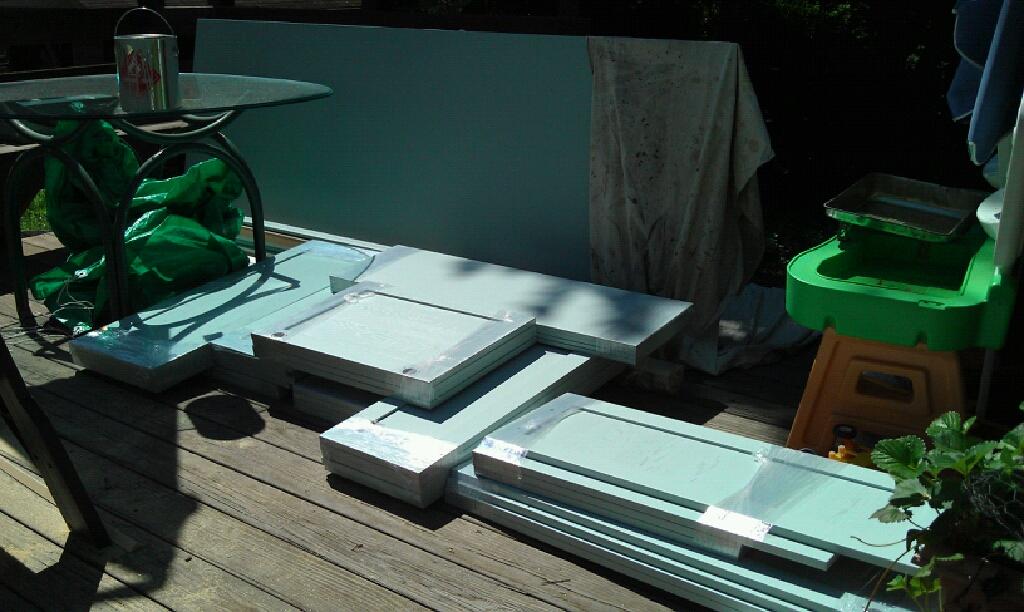
Cabinet Doors and Drawer Fronts All Ready to Go!

Cabinet Install Update:

The contractor installed the base corner cabinet where the chimney is located first since everything on this side of the kitchen connects to this unit (we still have to decide whether to install a smaller lazy susan or a pair of slide out units) . They have also installed the upper cabinets on the north wall. Today they are working on moving the plumbing for the sink and installing the run of cabinets on that wall (up to the wrong size cabinet which is fortunately at the end of the run). The upper cabinet where the chimney is located will need some more cutting and adjusting to fit.

Also the painter dropped off the doors and trim today! Andi kindly sent me a photo. The finish looks lovely!

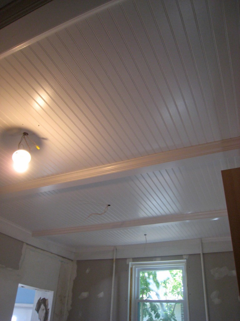
One more shot of the beautiful ceiling!

1 Comment

The Beadboard Ceiling!

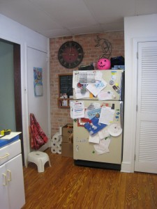
1990s Drop Ceiling (& Kitchen) Before

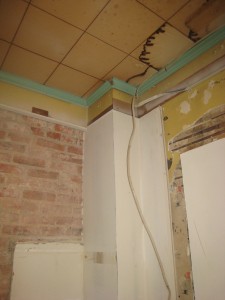
1950s Ceiling Covered up by 1990s Drop Ceiling

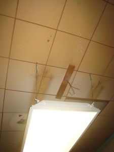
Florescent Light (installed in 1990s drop ceiling) and 1950s Ceiling Above

The beadboard ceiling is finally finished at Andi & Neil’s house! I haven’t seen it in person but from the photos that Andi sent me yesterday it looks lovely!

This is now the 4th ceiling that this kitchen has seen.

The History of the Ceiling:

1890s: Plaster Ceiling

1950s: Glued on 12×12 acoustic tiles with interesting turquoise crown molding

1990s: Drop 2×4 Acoustic Ceiling (with 2×4 Florescent Light Fixture): Dropping the ceiling by about 9″ in height (I don’t know what people were thinking when they did this!)

2011: Painted Beadboard and Beam Ceiling

Historically Accurate?

I get asked questions about whether beadboard is historically accurate to a kitchen (or other rooms in the house). The answer is yes, but probably not as detailed as this one. Traditionally secondary spaces such as the kitchen and bathroom used less expensive materials and trim. For example in our kitchen (now dining room) they installed beadboard on the bottom 4′ of the wall. They also used plainer window and door trim but they still used a plaster ceiling.  They would not of installed nice “beams” or crown molding, instead they would have probably trimmed these spaces with a simple straight piece or no trim at all.  Around here, I haven’t seen a lot of beadboard kitchen ceilings, mostly plaster. It is probably a matter of what the local tradespeople at the time were in the habit of using.

Now that the kitchen is such an integral part of our lives, I think it makes sense to design it to the same level of finish as the rest of the house. I also think you should have a little fun with the design. There are too many boring drywall ceilings out there.

Up Next:

The contractors are scheduled to spackle the walls and sand the floor today. It is nice to start to see some finish work.


Leave a comment

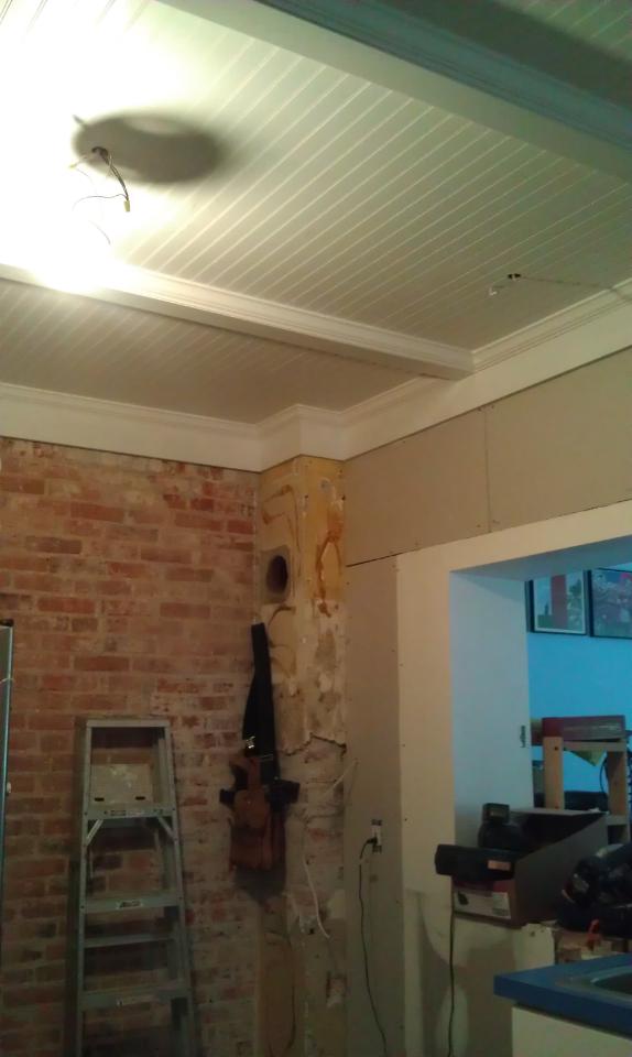
Ceiling & Drywall Progress: the first bay has the beadboard plywood installed & they have added drywall to the wall

Andi and Neil’s kitchen is still in the not so exciting to look at phase. The contractors should be there all week which is good news! The ceiling is partially done. They ran into a small hiccup, the the old florescent light that is providing temporary light is hooked into the old knob and tube wiring. They are getting ready to disconnect this, but the new lighting has not arrived yet. So they can’t finish the rest of the ceiling until the new lights arrive. Fortunately they should be here today (fingers crossed). They have installed the 1×8 trim piece around the top of the ceiling. I had them put this in to make sure any uneven wall conditions would be covered up. We will be adding 3 “beams” at approximately 4′ intervals. Not only will this provide visual interest but it will give us a place to seam the beadboard. Most beadboard paneling comes in 8′ lengths (although you can get longer 3/4″ thick pine beadboard pieces in up to 12′ lengths).  The kitchen is about 9 1/2′ wide (so we couldn’t run the beadboard in that direction). The 4 “bays” that are left are designed to have lights centered in them (except for the one over the fridge). We centered the bays such that the light over the sink could also be centered in the bay. It is always a little tricky to get the beadboard spacing right. Unless you have a perfectly symmetrical room you usually have to decide what takes precedence. In our Dining Room we centered the ceiling on the room (and the light fixture) but our windows were not centered on the room, so they don’t align with the ceiling. Andi & Neil’s case is similar. The door openings and opening to the sunroom don’t align with the panels but the lights will all look nicely centered in the ceiling.

The beams will be created out of a 2×4 and then covered with a 1×4 piece of mdf or poplar. Then crown molding will cover the sides. It is a pretty simple system that provides a lot of interest.

1 Comment

East Wall

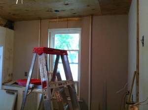
West Wall

 
I stopped by Andi & Neil’s house yesterday to see how things were going (sorry about the photos being blurry, they were taken with my phone). We are now at the point in the renovation where things appear to slow. It is not that things aren’t happening but electrical work and prepping for the final surfaces is not very exciting to look at! The contractors were busy yesterday putting in the electric for the light fixtures and electrical outlets. They have also finished furring out the north wall where the stove will be, patched the floor and installed the plywood on the ceiling for the beadboard.  They were also finishing up some miscellaneous drywall patching. Next on the list is the beadboard/beam ceiling. Then comes paint (which there isn’t a whole lot of) and refinishing the floor. Then finally the cabinets can be put in.

Leave a comment


Our Kitchen: Large hood w/ tile backsplash

So, you are thinking about embarking on a kitchen renovation. Where do you to begin?

When redesigning a kitchen, people ask me where do you start. I tell my clients that they should do a couple of things before moving forward:

1. Collect images you like of kitchens, appliances, details and colors.

These don’t have to be whole kitchens but understanding someone’s basic style is useful for developing a plan.

A good place to start are the brochures from different cabinet manufacturers and home magazines. Also look at your friends and family’s kitchens. What do you like? What don’t you like?

2. How do you use your Kitchen:

Do you cook a lot? What kind of food? Do you bake? Do you need a desk? What kind of maintenance are you willing to realistically perform? Do you have specific storage needs (i.e. cookbooks, display of special china, lots of pots and pans)?
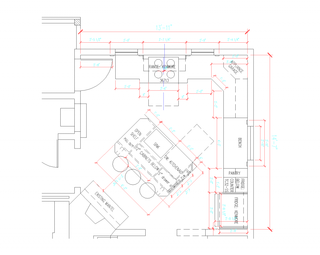
Our Kitchen Plan

3. Develop a Plan:

This can include hiring a designer, drawing it yourself on graph paper or on a free program on a computer. You will need these dimensions to start developing an estimate and will help contractors to start to ballpark the cost.

Are you moving walls, plumbing and electric? Are you putting on an addition? Sometimes it is useful to hire an architect to help you see what your options are at the beginning. Sometimes I come in and offer “schematic design”. In this case I would show a customer a couple of options for different layouts. This way they could determine the scale of the project and get some rough numbers before proceeding with the detailed design. Then they could either proceed with the architect or designer or if it is straight forward, proceed with using a typical kitchen designer from a showroom.

This is also a good time to review your electrical & plumbing service to your house. Also whether you need to replace move windows and doors in the room.

4. Begin to Develop a Budget:

I know it is intimidating and hard (especially when you aren’t quite sure what you want) but having a rough budget (and especially a maximum number) is very important. I think it useful to think about what is most important to you. When we did our kitchen renovation we splurged on Soapstone countertops and saved by installing the cabinets and trim ourselves.

There are quite a few items to consider  when pricing out the cost of a kitchen.

-The Cabinets (these are typically the most expensive item and prices vary widely).
Flatpack ($): Ikea is usually one of the least expensive options (especially considering the pull out options that they offer)
Standard Size ($): Off the Shelf Cabinets. Home Depot & Lowes and other places sell these (usually very limited sizes, often good for a pantry or basement)
Semi Custom ($$-$$$): Kraftmaid, Martha Stewart for HD, Thomasville (I recommend comparing prices at HD, Lowes & your local kitchen place). These come in a large number of sizes with lots of options. The options typically add quite a bit to the price. Typically these units come in 3″ intervals, although you can sometimes customize for an additional fee.
Custom ($$$-$$$$): Either a local cabinet maker, a distributor or directly through a shop such as Crownpoint. This use to be a lot more expensive but lately I have been finding that some local cabinetmakers will match the price of a semi-custom kitchen. Also if you have a small or difficult layout sometimes it makes sense to use at least some custom cabinetry to get the most our of your space.  For islands it is often nice to have a higher quality product, since it is visible on all sides and it is nice to add furniture details.

The Counters (prices vary widely. typically templating and install is included in this price):
Plastic Laminate ($): Inexpensive and now come in lots of fun colors and more realistic faux finishes. The downside is that you can’t buff out scratches and it can get burn marks on it.
Wood ($-$$): Ikea offers a big selection at a good price but typically wood requires a lot of maintenance. I recommend a marine grade sealer if you are going to use it.
Solid Surface ($$-$$$):  (i.e. Corian). Scratches can be buffed out but it can get burn marks similar to plastic laminate.
-Quartz ($$$-$$$$): It can look like stone or have a more uniform appearance. It is hard like stone but does not require a sealer like stone does.
-Stone ($$$-$$$$$): Prices vary widely depending on the stone. Marble requires more upkeep than granite but both require periodic sealing.

The Appliances:
-Appliances vary widely in price. I recommend going to a showroom and seeing what you like. It is also a good think about what you really need. Is a good stove with a high heat burner important to you? Do you bake and need a really accurate electric oven? Do you need a giant fridge to hold all the food your kids eat?

-I recommend in most regular size kitchens sticking with a 30″ range, to maximize countertop space.

Sink & Faucet:
-These vary widely in price. Fortunately there are some reasonably priced models out there now if you look around. Would a second smaller sink help if you have two people cooking in the kitchen?

Lighting:
-Consider general lighting (typically overhead), spot lighting (i.e. over the sink), under cabinet lighting. I recommend using all three. Having multiple lighting sources is really important!

Flooring:
-Can you reuse your existing floor? If not there are lots of choices at all different prices from vinyl tile, to wood floors to tile. Typically I recommend installing the floors before the cabinets if possible. It means a lot less cutting for the installer and then if you ever change a cabinet out then you won’t need to patch the floor.

Contractor:
-Contractor fees vary widely. Typically includes, demolition, repair of walls, ceiling and floors, hanging of cabinets, installation of electric and plumbing. Also keep in mind the cost of extra materials, including drywall and trim. Typically I recommend getting 3 quotes.

Design Fees:
-Fees vary from free (a kitchen place will often develop a simple kitchen layout for free) to 10% or more. This totally depends on the scope of the project and how detailed you want the design to be.

Contingency (10-20% of the project):
-This is for the unknowns on the project. This is the money that you don’t tell you contractor about but keep for when something arises that wasn’t planned on. Typically the older the house the more you want to set aside.

5. Schedule &  Logistics:

Realistically how long are you willing to be without a kitchen? How much of a temporary kitchen do you need? Where are you going to cook while the renovation is happening? Where are you going to wash your dishes? Do you want to plan to be away during part of the construction (although then it is harder to keep an eye on the progress)?

When undertaking a major kitchen renovation you should plan to be without a kitchen for at least a month, often longer. A contractor can give you a rough schedule, but you should plan for an extra couple of weeks.  Think about what time of year would be best for you to be without a kitchen.  I don’t recommend having a kitchen redone right before a big event (i.e Thanksgiving, a wedding, a birth) because that can lead to disappointment and having to sacrifice quality for time. Also contractors almost always starts after they say they will. Additionally factor in time for delays in cabinet delivery, countertop templating and installation,  and final punchlist items.

One Final Thing:

There are 3 factors to consider when doing any kind of renovation: price, time and quality. Pick two!

Good luck! A kitchen renovation is almost always a painful experience but fortunately it doesn’t last forever (it only feels like it) and afterwards you will be able to enjoy the space for long time.

2 Comments

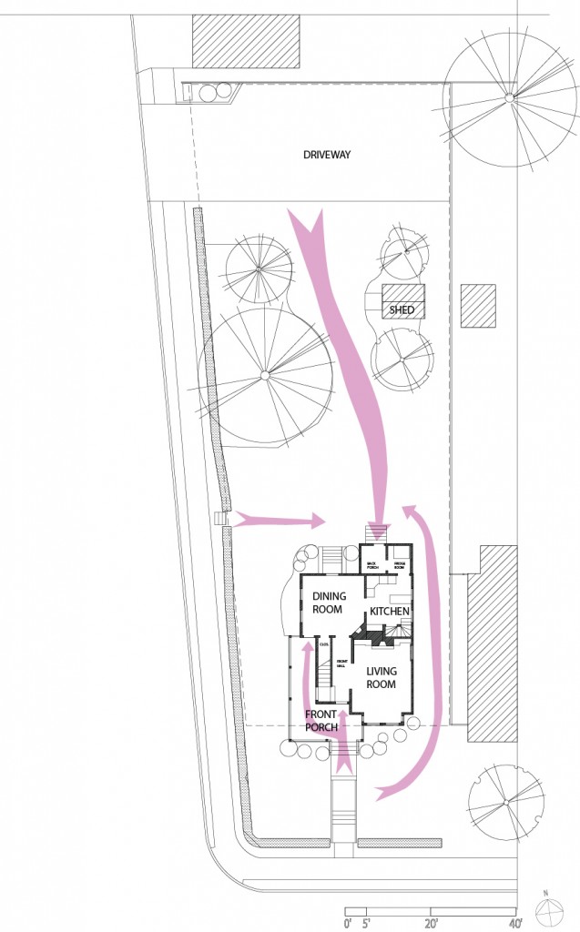
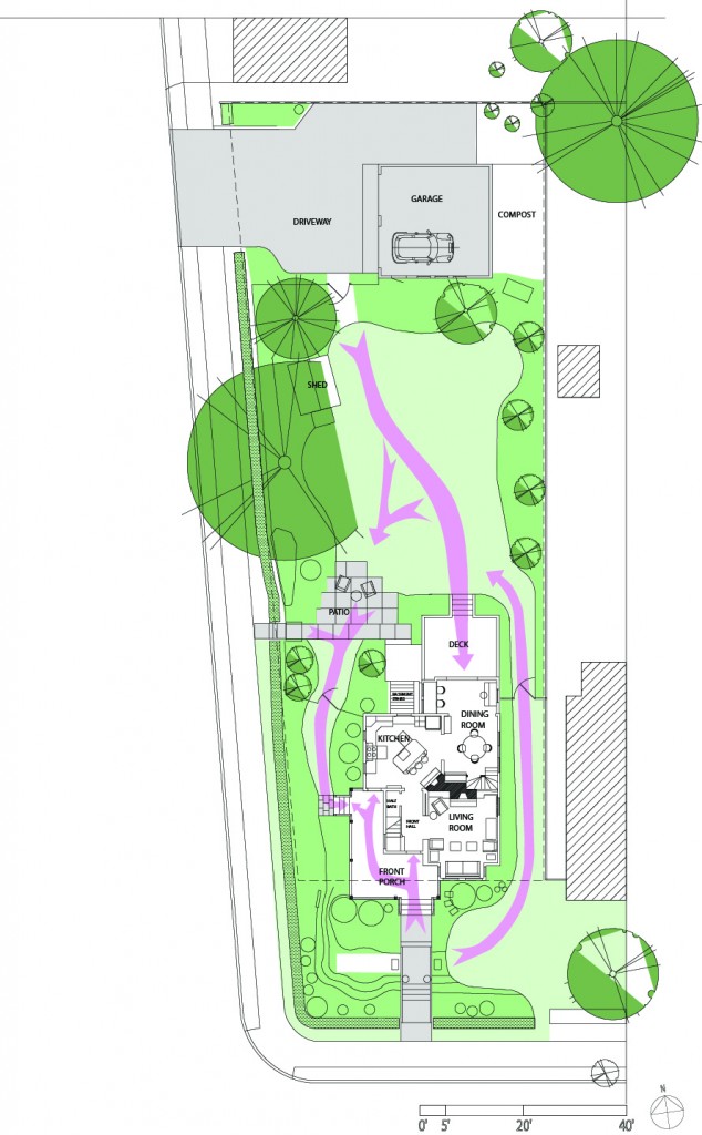
I thought it would be helpful to show everyone the original siteplan and first floor compared to the the current configuration. I also added some arrows to show the connections and pathways through the yard.

House Circa 2000:

-The only landscaping where some overgrown shrubs in the front yard and a large pine tree, dogwood and birch tree in the backyard.

-The Yard slopes down significantly towards both streets. Mr S. wiped out several times trying to mow it.

-The Entrance at the back of the house was not very welcoming or easy to use. Through the back porch and refrigerator room to the kitchen. Yuck!

-The Front Porch was nice, but very exposed to the street and had no side entrance.

-The Kitchen was tiny and the fridge was in an unheated adjacent space. The layout was horrible (it included 3 doors, 2 windows and a back staircase). The connection to the rest of the house was poor. You couldn’t see the backyard from the space.

-The Dining Room was really large, but not very well used.

Current Configuration:

-The landscaping has limited the grass to walking areas and play areas. Lots of perennials, shrubs and trees have been added to provide privacy, add visual interest and to encourage butterflies and birds.

-The House has been opened up to the backyard, providing better light and visual connection.

-The Kitchen and Dining Room switched places, providing us with a large kitchen and a smaller but functional Dining Room.

-We reconfigured the back porch/refrigerator room to be open and have a built-in desk space as well as a space for the piano.

-We added a patio and deck to the backyard to better utilize the space.

-We finally added a second set of steps to the backyard from the porch. Now we can go from the front to side yard and also from the kitchen to the backyard easily. Why did it take us 11 years to do this. hmmm…

Leave a comment

The Kitchen

April 5, 2011 — 1 Comment

I’ve been really slow to take pictures of the inside of the house. It is probably because I always feel like nothing is ever finished. There are always more projects to do, but I have decided that I should give a mini house tour.  I can at least highlight the things I like about each room and what is left to do.  So without further ado here is the kitchen (aka the old Dining Room).

Favorite Things: I love the space and the light. It is really the center of the home. We both love to cook and this kitchen gives us lots of space to do that. I also love all of the color. We went fairly neutral on the cabinets but we went bright on the walls and with the accessories. I also love the soapstone countertops.

Things that Didn’t Fit: In order to make this room the kitchen, I was a little short on storage (partially because we have so few upper cabinets). I didn’t have enough space for a pull out pantry or a pull out garbage can. We use the old island in the basement for extra storage and I don’t mind having a freestanding garbage can.

Stuff left to do: Trim around the fridge, redo the front of the bench (where the kids have banged up the radiator grating and trim), and add some additional floor molding.

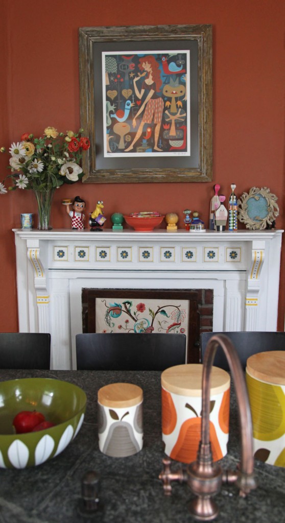
View from the sink. I love that I get to look at the old mantle and all of the funny tchockies and art we have collected as I do the dishes. The print is by Tim Biskup and the canisters are by Orla Kiely (for Target).

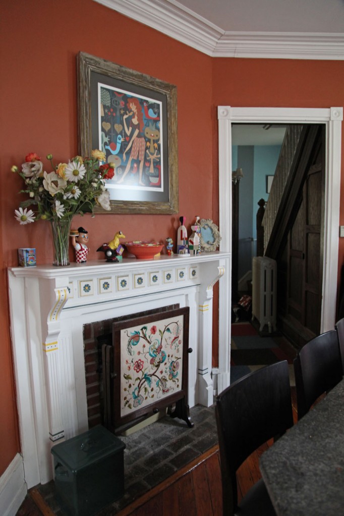
The mantle complete with vintage fireplace screen. The screen hides the litter box. The front hall is in the distance.

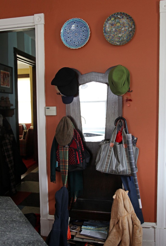
The vintage coat tree. The kids use the lower legs to hang their coats. The front hall is to the left. There use to be a door here to the closet (now the half bath).

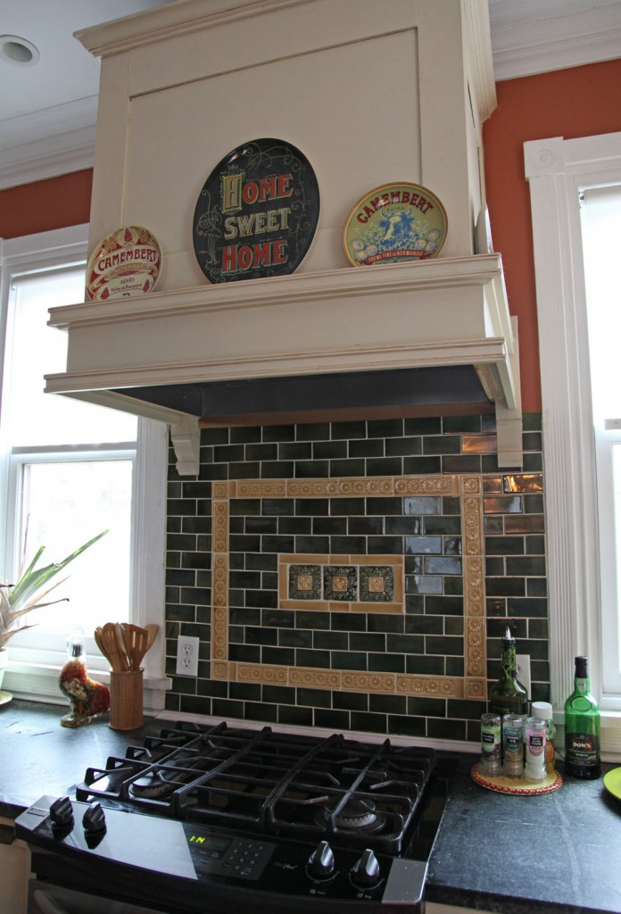
The stove with a custom hood that we built. We had to change out the windows for smaller ones to make this work but I love how it came out. I can look out the window while I cook and the tile is beautiful.

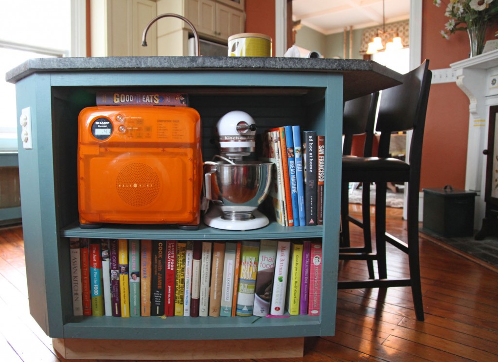
The end of the island. This houses most of our cookbooks and our microwave. When I designed the kitchen I really wanted a place to hide the microwave and to store the cookbooks.

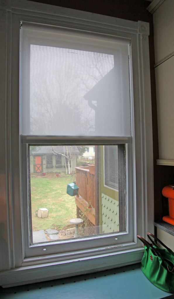
The window facing the backyard. There is a bench below that hides the radiator. It is a favorite place for the kids to sit. It is also nice to be able to keep an eye on the kids in the backyard and watch for my husband to come home.

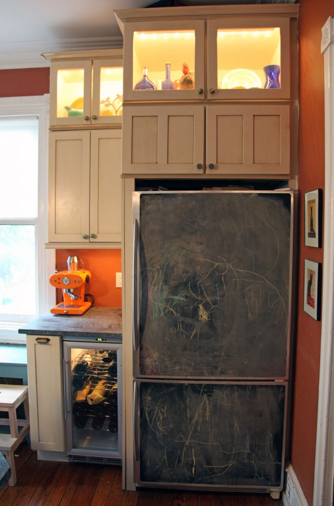
The fridge. It is a standard fridge with a custom stainless steel frame (by Frigo Design). Inside the frame we installed thin boards with chalkboard paint. The kids love it! Now if I could just get to installing the last couple of pieces of trim on the side and top of the fridge.

1 Comment