Archives For -Kitchen

kitchenfabric-spike

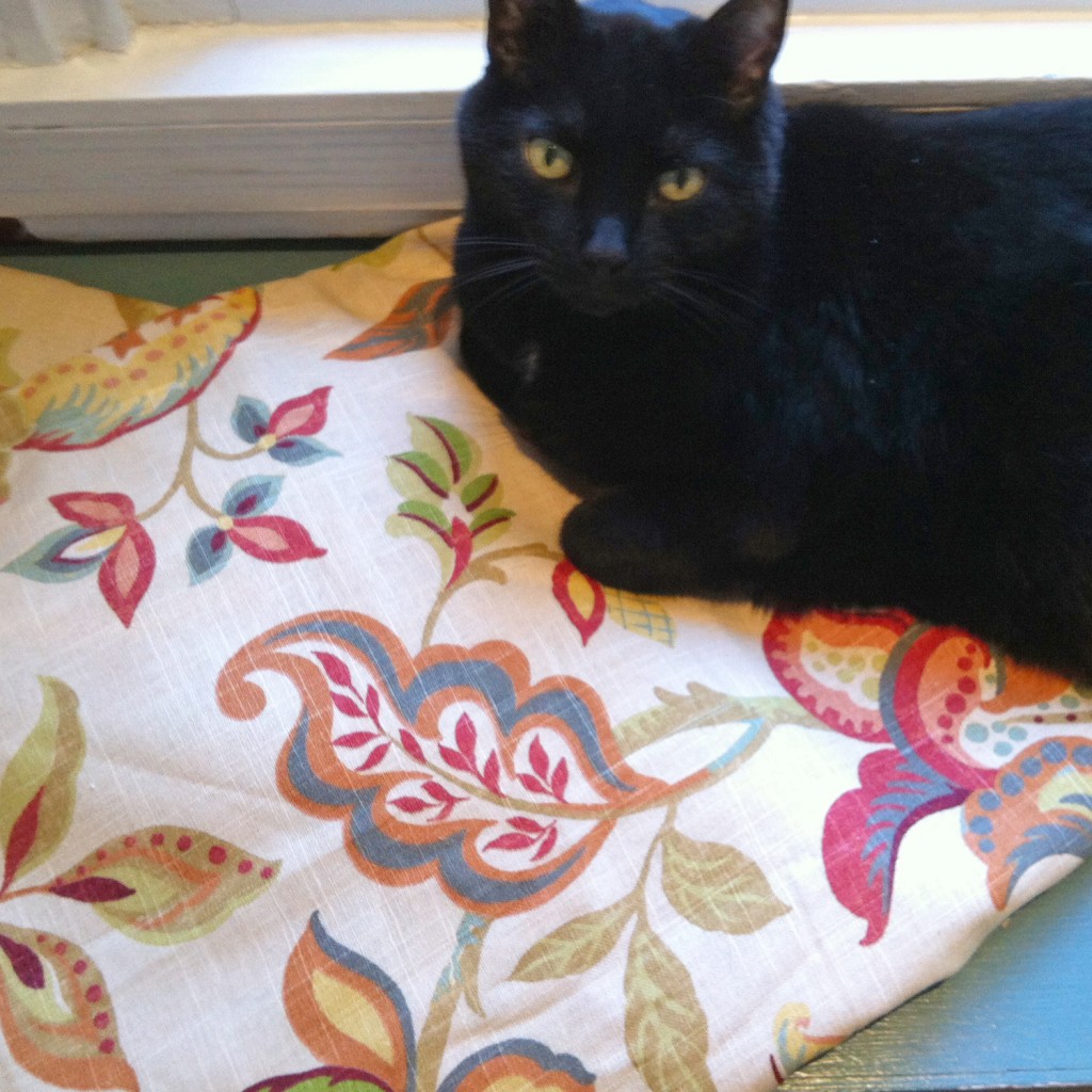
In the midst of trying to figure out all of our second and third floor plans, I was temporarily distracted by some pretty fabric. For some people it is shiny things, but for me a good pattern makes me happy and distracts me from more important endeavors (especially late at night while surfing the internets after Mr. S. has fallen asleep). I have been on a very long search for the perfect fabric for our bedroom curtains and while searching one night (specifically fabricguru.com) I came upon a nice Jacobean pattern with good potential (Richloom Kathrann Printed Linen Blend Fabric in Garden). It had a nice large size pattern, a good mix of colors and the pattern and was a nice mix of modern and pretty. The only issue was the background color. I really want a white background, to work with the future white window trim and to lighten the gray walls. By the pictures it was a bit hard to tell how far off the background color was. I stopped by JoAnn’s to see if they happen to have it in stock.

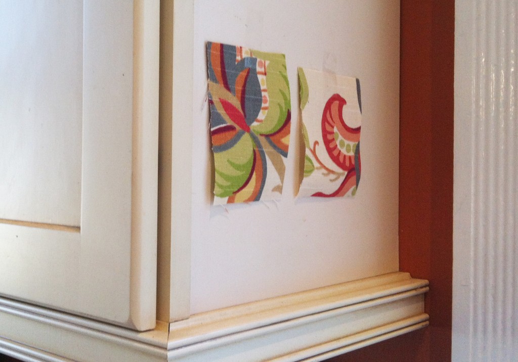
fabric-sample

And just by chance they did have some of the fabric, so I asked very nicely for a sample and they gave me 2 to bring home. I immediately knew that it wasn’t going to work in our bedroom with the cream colored base but as soon as they were sitting in the kitchen I thought that I definitely need to use this fabric in here for some window valances. Because that is a priority right now (hahaha)!

richloom-kathrann-fabric

I ordered enough fabric for the windows with a little bit of extra for a couple of other small projects from fabricguru.com for the awesome price of about $6 a yard for 4 1/2 yards in 2 pieces (this retails in the $25-35 range). In addition to selling fabric by the yard they apparently have a lot of leftover small lots that they offer at really good discounts. Wow, I have just found a new place to spend many hours searching for the perfect fabric!

It is funny that one of the first things that I did when we bought the house was take down a lot of curtains and valances to let in the light and now I am putting them back up (of course in much nicer fabric that is not from the 1970s). I’m not quite sure to think about this development. We do have solar shades on a lot of our windows, which I do really like but they are a little ho hum looking.

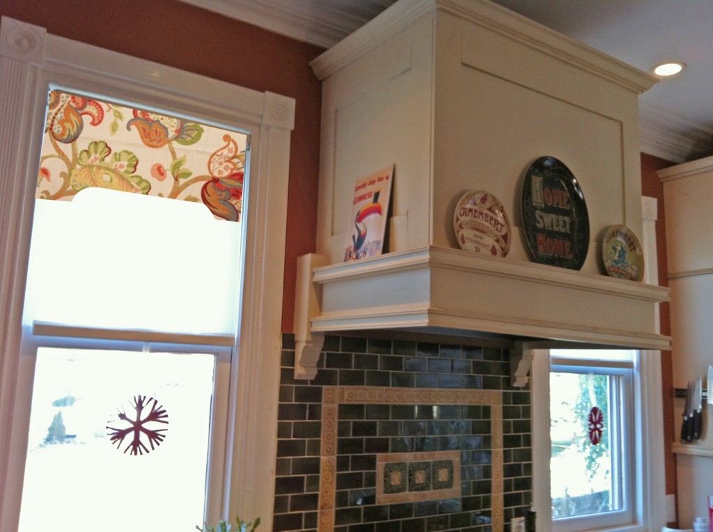
kitchen-windowvalance-render

I just whipped up a rendering of what a valance might look like in here. I like it. I am considering actually making it with a solid backing and padding it slightly and using some decorative nail trim. Although if I follow something closer to my Dining Room valances, they would be easier to take down and clean. I do want to mount them inside the frame, so as to not obscure the nice trim.

What do you think? Does anyone else have a fabric obsession?

Leave a comment

My little helper

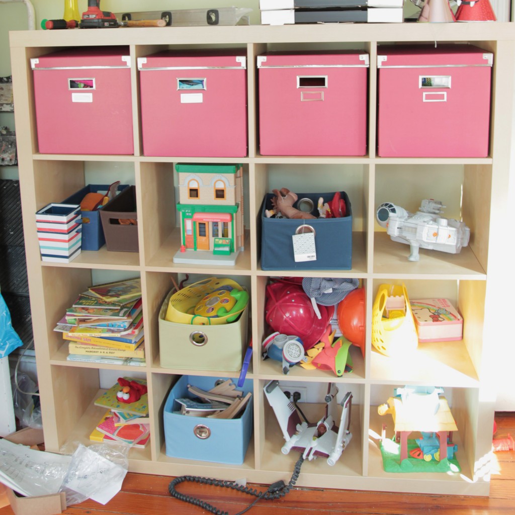
I know it has been a while! Life has been busy, fun, frustrating, tiring and everything in between the last few weeks. I’ve been trying to stop and enjoy some time with the kids before school starts. With my little man getting ready for kindergarten, there is going to be some adjusting. As part of the getting ready for fall, I have been trying to get the house in better order. It has been a painfully slow process. I did manage to get some of the shelves up in the Playroom. I am planning on adding a second set on top and some additional wall shelves. That will probably take a while, but at least we have some cubbies to start to put the kids stuff in.

Playroom Shelves, up but not organized!

Meanwhile, I saw that Jen from Rambling Renovators is going to be writing a book called Blogger Style. She is taking entries for interiors designed by bloggers (due by September 15th). It is a pretty exciting opportunity, even if my own chances of making the cut are small. I have also been meaning to put together a house tour for my blog for ages, so I am trying to use this as a catalyst for taking some pretty pictures of the house. I tend to get bogged down in the actual construction of things, and it feels like I never get around to the final pictures and staging. So for the next couple of weeks I am going to focus on the pretty aspect of my house and try to ignore all of the other unfinished big and small projects and put some makeup on her. After all I think she deserves it! I have certainly been pinning up enough pictures on pinterest for inspiration.

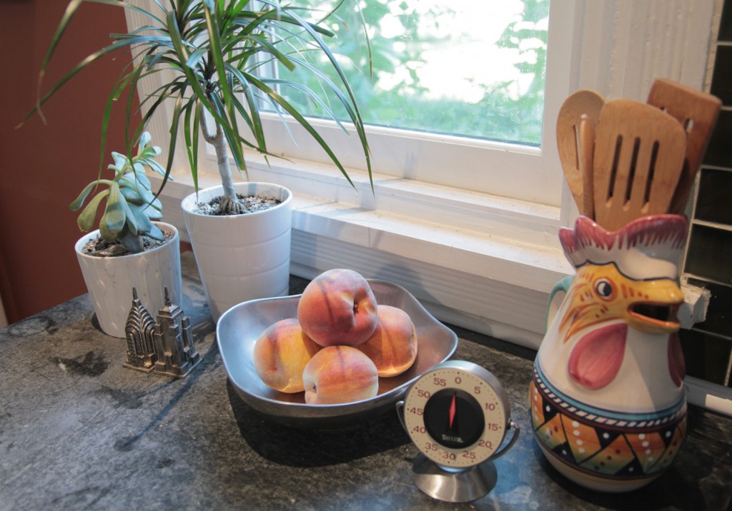
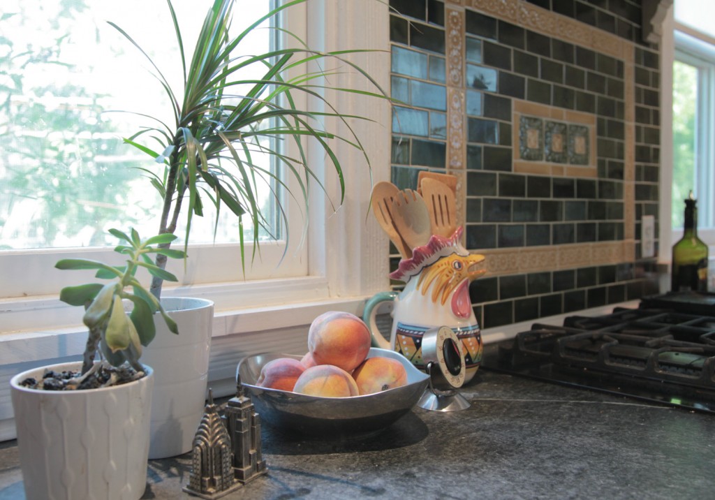
Kitchen Counter in progress

As part of this process I actually need to do a little shopping (mostly from around the house but it is also time to pick up a few things to make the house feel fresh). I am working on taking some photos now, so I can take a look and tweak things before I shoot better photos. It is amazing the things that are obvious only after you take a photograph (eek, those window sills need to be cleaned and I really need to oil the counters).

Kitchen Counter in progress

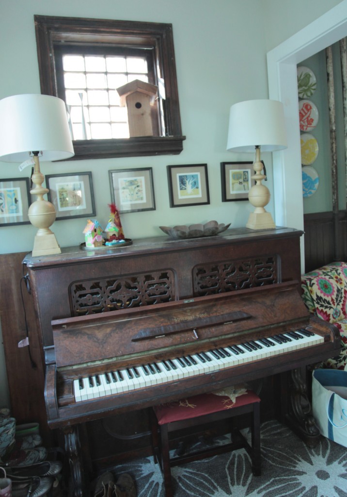
For example, the area on top of the piano had become a dumping ground. I am hoping by paying some attention to it, I can make it more of a focal point.

Piano w/ new lamps and kids artwork

I bought these new lamps yesterday at Homegoods. They were are really good deal ($29 a piece) and I really liked the height and shape.  I don’t care for the color. I am now trying to decide what color to paint them. I am currently thinking about red or blue.

Red Lamp Option

Blue Lamp Option

What do you think?

2 Comments

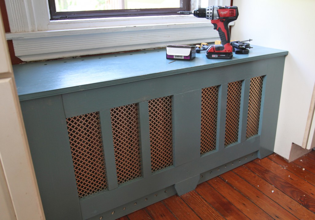
Radiator Cover & Bench after Repairing and Fixing it

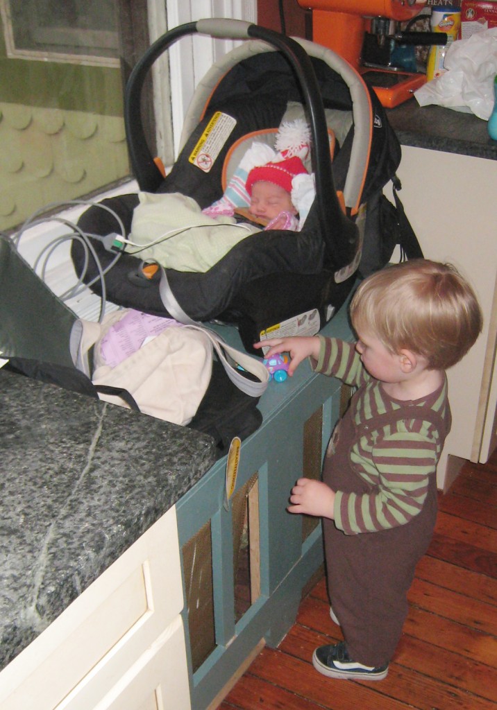
One of the things I wanted in our kitchen when I was designing it 6 years ago was a window seat. I think I looked at too many interior design magazines where I saw kids sitting happily on the window seats while their mom’s cooked. Well, I managed to fit one it, which was great. And I have to say I really do like having a place to sit while we cook. It has been used everyday since we put it in. It was where the babies took naps in their carseats, where they play with their toys and where they spend lots of time looking out the window. It is also a favorite spot for our cats (especially in the winter when the radiator is going).

Maisie in her carseat sitting on the bench  the day she came home from the NICU with Sam

We installed an old giant radiator underneath the back window it to heat the room (and replace 2 smaller ones that were in the way).  It also meant that we could keep the large window that overlooked the backyard (something I was pretty adamant about), while replacing the windows that faced the road with smaller windows that allowed for more counter space. When I made the cover I was in a bit of a hurry. I think it was before a holiday. Anyway, I made a 2×4 structure with various 1″ thick poplar pieces for the face. We also installed bronze grill in between the finished wood and the backup structure to hide the radiator. While the backup structure was screwed in, the cover pieces were nailed and glued. This held up fine until my kids started walking, since then it has been taking a beating from both kids and it didn’t pass the test!

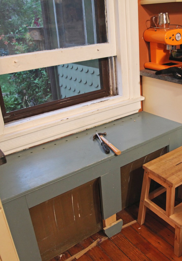
Bench earlier this month before fixing it! (the extra pieces were in a box in the Dining Room)

It has been deteriorating for the past couple of years, as I tried to ignore it (and even managed to keep it out of the photos). Well with Sam’s Party approaching we put it on the list of items to fix. The good news is that my wood working skills and tools have improved since then! So I was able to take the pieces and reassemble them using my Kreg tool. Then I bought new bronze grill and added extra wood at the bottom to provide some extra structure.

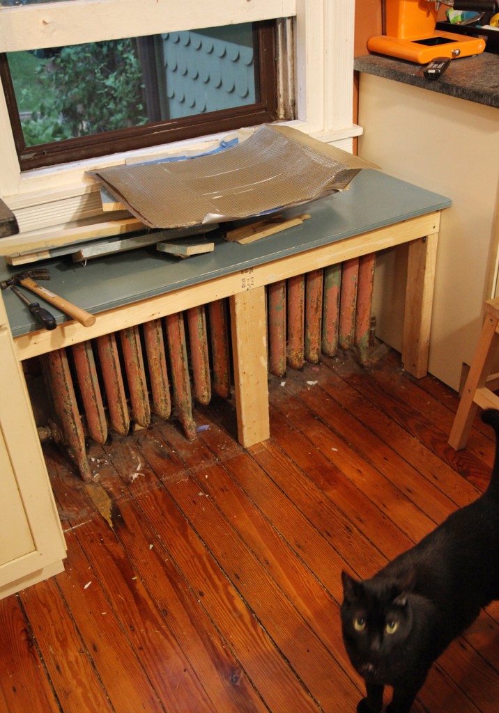
Bench striped back to its structure (with Spike)

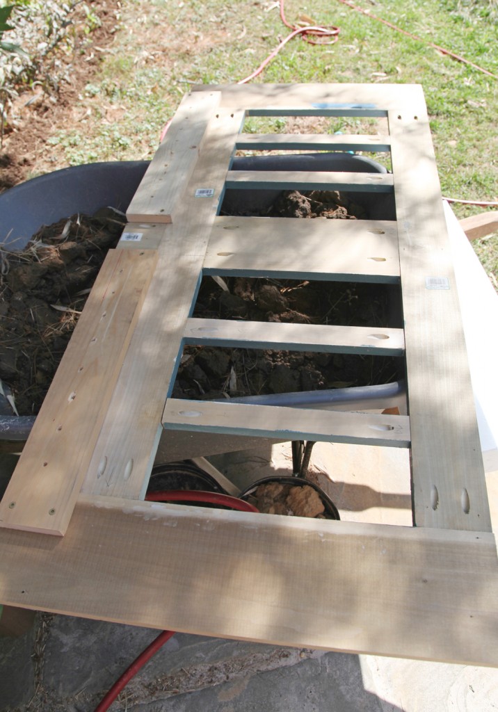
I took off the remaining pieces (which took about 10 minutes). Spike our cat was very suspicious. I then took out all of the old nails and screws. While I was at it I added a couple of extra screws to the back up structure.

Bench front after installing pocket screws using the Kreg tool

Previously I had installed the pieces 1 by 1 onto the frame. This time I decided to make the frame one rigid piece with pocket screws (and the Kreg tool). As you can see, I used a LOT. I really don’t want this falling apart again. I also added 2 pieces at the bottom (with holes) to make it more rigid and prevent the kids from kicking the bottom of the bronze lattice. After this I tested to make sure it would slide into place (which it fortunately did).

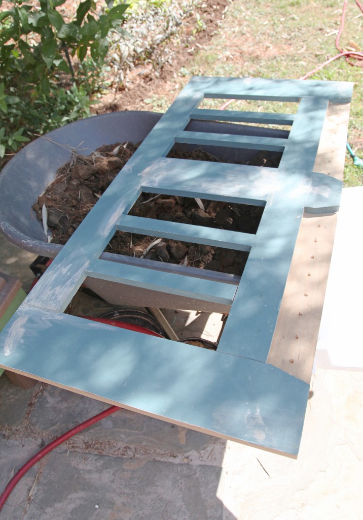
Then I patched and painted the front (the same color as before so 1 coat was enough).

I patched and painted the front (which I had previously done it place). It was a lot easier to paint this before installing the bronze lattice. Plus the off-gassing from my old school oil paint was done outside.

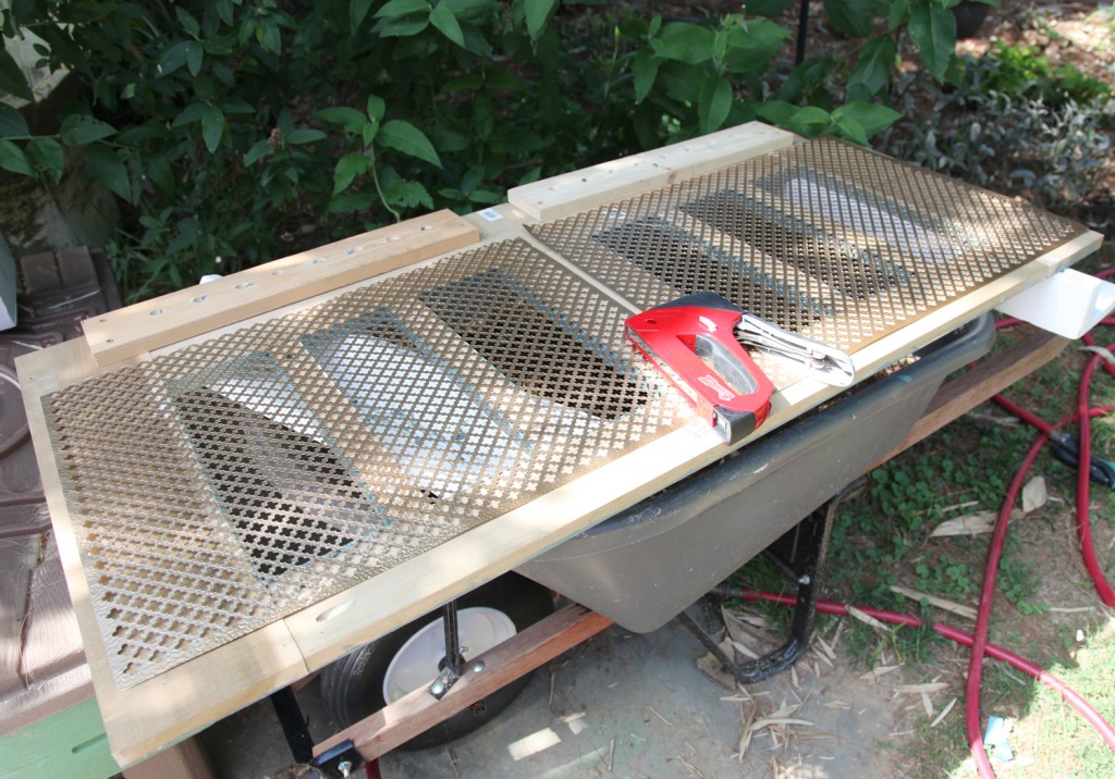
Stapling the bronze lattice to the back

After it was dry I flipped it over and installed the bronze lattice. We choose a quatrefoil pattern (from Killians Hardware in Chestnut Hill). I used my staple gun with 1/2″ staples and went to town. I used a LOT of them in both directions (I REALLY don’t want this come apart again). The good news is that this new lattice is stiffer then the old sheet, so hopefully it will hold up.

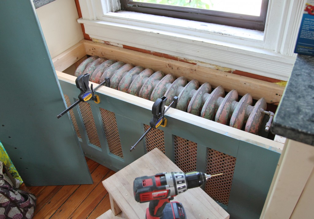
Reinstalling the front of the bench

Then I reinstalled the bench. On the top I screwed it in from the back. Towards the bottom I used several screws and countersunk them. The top has always been removable (to access the radiator).

Radiator Cover & Bench after Repairing and Fixing it!

So there you have it! The project took several hours over about 5 days. I don’t think I spent over an hour on it any one day. The new lattice is really nice (the photo doesn’t do it justice). Hopefully this one will hold up until the kids are old enough to fix it themselves.

Leave a comment

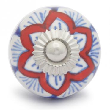
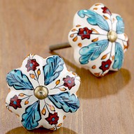
Hand Painted Red & Blue Knob w/ Silver Insert, $7.99 from potteryknobs.com

After lots of debate Andi and Neil have agreed on a hand painted ceramic knob for their kitchen cabinets! It only took 44 knob choices on Pinterest. I’m very glad that they decided on one that they can both live with. I think it is a lovely choice. Which is great news because I was starting to picture someone feeling angry every time they opened their cabinet doors!

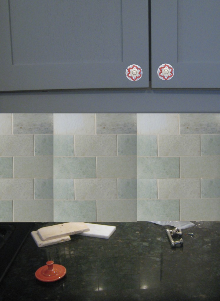
Tile and Knob Rendering

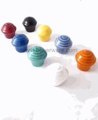
As a side note, we looked for a knob that matched their Fiestaware. It turns out such a knob exists! The company (Bauerware) just appears to be VERY bad at advertising. It took a LOT of searching, but here it is….

Fiestaware Inspired Ceramic Knobs, $15 by Bauerware

These are available in a couple of different sizes for all of your retro cabinet needs.


1 Comment

Inspiration for tile from "Sarah's Summer House" on HGTV

I stopped over at Andi and Neil’s house on Monday to check out some sample marble tile samples that they picked out over the weekend. We started out with this tile inspiration from Sarah’s Summer House on HGTV.

"Biltmore" Marble Tile in 2" Hexagon Pattern

"Biltmore" Marble Tile in Basketweave

This inspiration lead to these a couple of potential backsplashes from the Tile Shop. These were in a marble called “Biltmore”. Unfortunately this name doesn’t match any other manufacturers and these are only available online (they don’t have any stores near here), requiring ordering samples and waiting for delivery. The prices were quite reasonable, but we wanted to check and see if we could find something local.

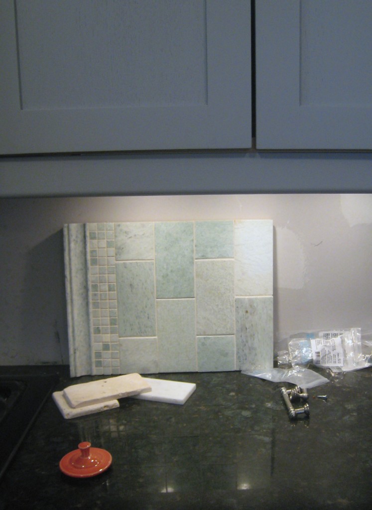
Polished Ming Green Marble Tile w/ Granite & Painted Cabinets

Andi and Neil took a look this weekend and picked up these samples up at Century Tile . This tile looks to be the same or very similar to the “Biltmore” but is called “Ming Green”. We are all in agreement that the variation in the marble is quite lovely. Two questions came up:

1. Was the tile color TOO simliar in color to the cabinets.
2. What size and shape tile should we use.

Our decision was that it was okay to be somewhat monochromatic with this but that we should pick a different contrasting color for the cabinet knobs (more on that in a bit).  Also the tile looks quite nice with the granite counters, picking up some of the green flecks. And after some discussion we decided that the 3″x6″ tile across the backsplash would look clean and not take away from the nice variation in the marble tiles. If there were a bigger backsplash behind the stove I would recommend changing patterns, but because the backsplash is fairly low and continuous I think this is the best decision.

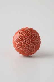
So now that the tile is decided on what do we chose for the knobs. Andi pulled out some of her fiestaware to look at for inspiration. The “persimmon” color (orangy red coral color shown in bottom left of picture above) is a lovely contrast to all of the cool blues and greens. This meant back to the drawing board for more knob options. I had trouble finding just the right color. Here are some of the knobs I came up with:

1. Coral Ceramic Knob, $8

2. Red Granita Knob, $8

3. Resin Knob, $14

4. Ruby Glass Knob, $3.49

5. Honey Glass Knob, $2.99

6. Amethyst glass knob, $3.49

7. Amber Glass Knob, ~ $5.50

8. Blush Glass Knob, ~$4

9. Button Knob, $8

List of Knobs:
1. Melon Knob in Coral, Anthropologie, $8

2. Red Granita Knob, Anthropolgie, $8

3. Resin Kelmscott Knob in Plum, Anthropolgie ,$14

4. 5. & 6. Ruby, Honey & Amethyst Glass Knobs, Look in the Attic, $2.99-$3.49

7. Amber Glass Knob, Amazon, 6 for $33.30

8. Blush Rose Glass Knob, Amazon, 12 for $42

9. Orange Resin Button Knob, Anthropologie, $8

My preference is for #1 but I think any of these would look nice. I also did a quick rendering to see what the space will look like with the tile and a bright knob. It isn’t a great rendering but it does give a general feel for the tile and knobs.

What is your preference?

Quick Rendering with Tile and Bright Knobs

Leave a comment

Time to Pick Some Cabinet Door Hardware!

It is funny that sometimes the small stuff in a renovation is what causes the most controversy! Andi and Neil’s kitchen is almost done but there are a few things left to decide on including the hardware for the upper cabinets and tile for the backsplash (the contractor will be back in a week or two to finish the last of the things up once everything is delivered).

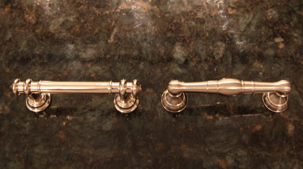
Handle Options: Final Selection Brushed Nickel on the Right

Andi and Neil found nice simple handles for the drawers on the lower cabinets. They are by Martha Stewart for Home Depot are quite reasonably priced (around $4.50) but have a nice heft to them. They are brushed nickel and go nicely with the Ikea faucet. But for the upper cabinets, I typically recommend knobs. I think visually they look nicer at eye level and I think it is a good opportunity to bring in some pop of color and/or texture. The other nice thing about using a knob is that they are easy to switch out. If you use a handle you are forever stuck with the hole spacing.

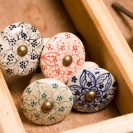
1. Handpainted Ceramic Knob, $11

2. Handpainted Ceramic Knob, $5

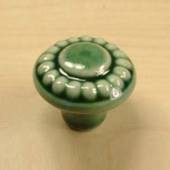
3. Green Glazed Knob, $3.29

4. Custom Made to Order Map Knobs, $20

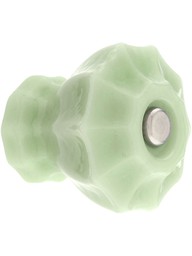
5. Jade Milkglass Knob, $5.39

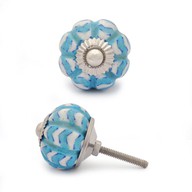
6. Chevron Patterned Knob, $8

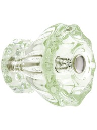
7. Clear Glass Knob, $5.39

8. Seashell Shaped Bone Knob, $10


I’ve rounded up a few of my suggestions here but we can’t seem to come to an agreement. It is crazy that we were in agreement about the cabinets, the layout and the overall colors. I stayed out of their selection for the counters, but they picked out a lovely dark granite. I was a little worried about it because the sample photos I saw online were a bit muddled looking, but the actual slabs are quite lovely and have a nice depth to them, that you couldn’t get with quartz (my original recommendation). For some reason I feel more vested in the selection of the knobs. I guess because I see it as a lost opportunity to bring another layer of texture and color to the space. Andi and Neil are not afraid of color (their living room is dark purple and the front bay of their house is periwinkle) so I am surprised to see reluctance on choosing something a little more fun.

I REALLY love the map knobs. I thought that Andi and Neil would be into them too. They have lived in and traveled to lots of places, so I thought customizing them to those places would be cool. I also found a second person on Etsy selling them for $10 a piece (rather than 20). I also found a posting on making your own custom knobs with printed paper and resin. Then the knobs could be done for even less. Then they could really pick out something interesting! Although now I think it time for me to step out of the decision even though I am a little sad about it.

Which ones would you choose?

List of Products:

1. Handpainted Ceramic Knobs, Fair Trade, $10.95 a piece. Green Heart Shop.
2.  Blue and Red Floral Ceramic Knobs, Set of 4 $20. WorldMarket.
3. Glazed Green knob. $3.29. Cabinetparts.com
4. Custom Map Pulls, 4 for $80. Etsy. Another option for $10.
5. Milk Glass Cabinet Knob in Milk Green (Jade), $5.39. House of Antique Hardware.
6. Chevron Patterned Turquoise and white ceramic knob, $7.99. Potteryknobs.com.
7. Clear Glass Cabinet Knob, $5.39. House of Antique Hardware.
8. Seashell Shaped Hand Painted Bone Knob, $9.99. Potteryknobs.com

1 Comment

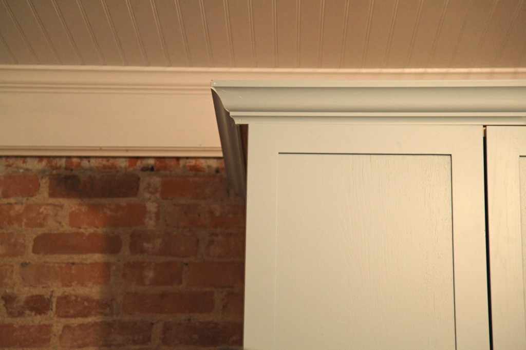
Painted Cabinet Door w/ matching painted trim (still waiting on final touch up on crown molding)

So are you thinking about purchasing Ikea Kitchen Cabinets and having the doors and trim custom painted? Below are some things to consider if you are headed down this path. The good news is that it can be done beautifully. The bad news is that it take preparation, organization, patience and finding a good refinisher. Here is a link to a good article from Carol Reed on this very subject. Also Sarah Richardson has used this method on several of her episodes before including on Sarah’s House (the farmhouse series).
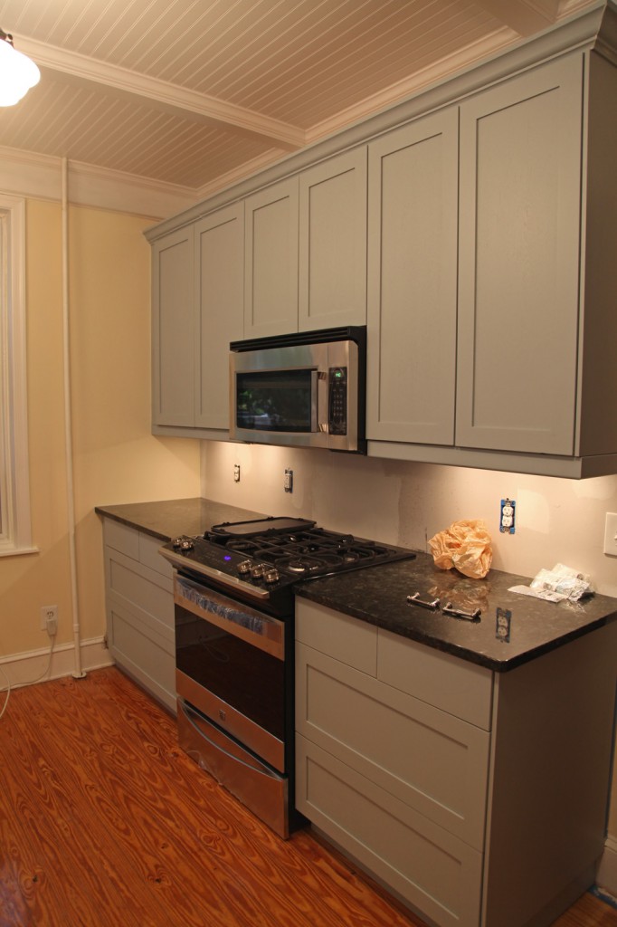
Installed Painted Cabinets and Trim. I think you would be hard pressed to know that these are Ikea cabinets!

Pros:

-You can have cost effective cabinets, with a custom color to your liking. Typically the painter can match any paint swatch you provide.

-Because the boxes on Ikea cabinets are never exposed, you don’t have to paint them, and can even start installing them while everything else is at the painters.

-By having the cabinet doors professionally spray painted, you will get a durable finish. The last thing you want to do is hand paint new cabinets and then have the finish wear off in a couple of years.

-Because you are having a custom finish applied, you don’t need to use Ikea crown molding for the cabinets. We chose larger molding for Andi and Neil’s kitchen.  Also if you are mixing Ikea cabinets with some custom millwork, you can have them all painted together for a seamless look.
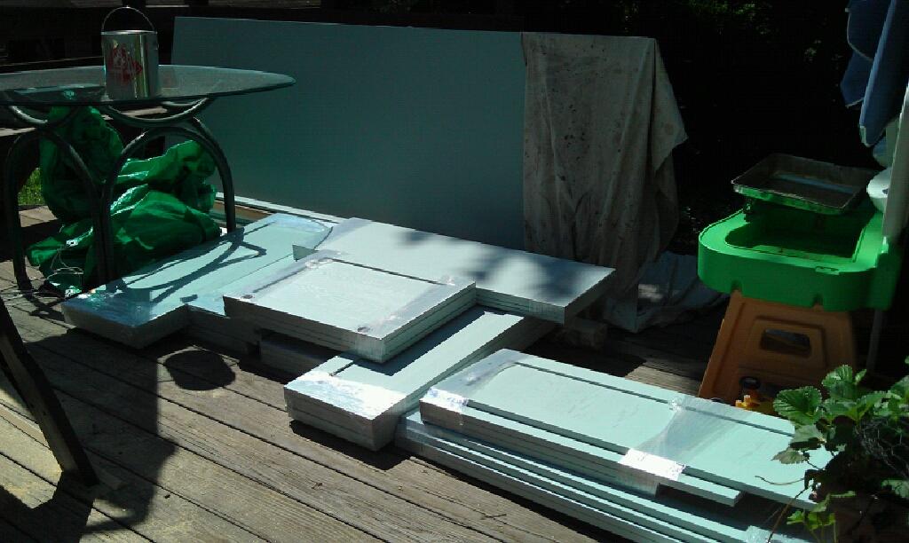
Cabinet doors, just delivered (good sides facing inwards)

Cons:

-Plan for the extra time it takes to have these painted (typically 2-4 weeks). The good news is that you can typically start installing the boxes from the cabinets while you wait for the doors, drawer fronts, trim, baseboard and panels.

-Professionally painting is not cheap. Plan on spending $35-60 a door to sand, prime & paint. Plus the cost of paint ($100-200) and possibly a set up charge. Also keep in mind that you also need to have all of the panels and trim painted as well. For a medium size kitchen, plan on spending $1000-2000 on painting. You will probably also want to pay to have a sample panel painted to make sure you are happy with it before you commit to ALL of the pieces. Try picking up an extra panel in the As-Is section at Ikea. Then you can have it painted while you wait for your cabinets to arrive.

-You will need to divide your Ikea order into 2 piles, boxes and doors and trim. Then either you will have to have the pieces to be painted dropped off or picked up. The Ikea delivery people are not going to help you in this. With Andi and Neil’s delivery, we tried to divide the boxes as they were coming in the door (then had to double check after they left). Before you send this off to the painter, triple check that all of the right parts are there! Also make sure to remove any miscellaneous hardware from the boxes before sending it off. We had to hunt down some missing attachment brackets at the last minute that we misplaced.

-You will need to match the paint for inevitable touch up (particularly on trim pieces).
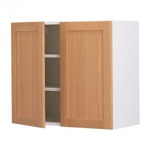
Tidaholm Upper Cabinet
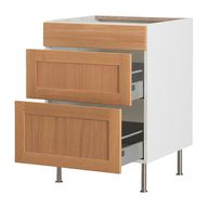
Tidaholm Lower Drawer Cabinet
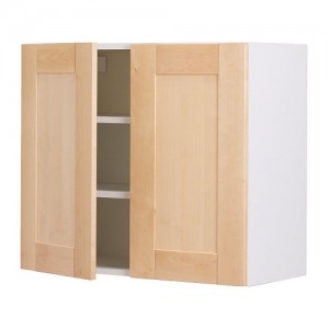
Adel Door
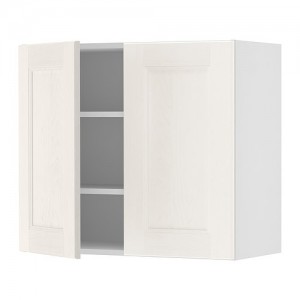
Ramsjo Door
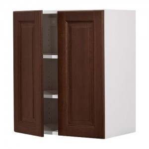
Lilje Door

Door Style Selection:

This is one of the most important steps in determining whether it makes sense to use Ikea cabinets. We chose the Tidaholm Oak Cabinet (in a clear finish) for our starting point. This cabinet has now been discontinued! This is very unfortunate, because it has a simple shaker look with solid oak frames and jointed corners. Currently Ikea is offering the Adel, but the joint in the frame is a v-groove which doesn’t look as high end. Also the frame proportions feel too wide. They are also offering the Ramsjo which is beach and the Lilje, which is an oak door with a raised panel. Unfortunately the Lilje only comes in a dark stain, which will make paint coverage more difficult. I haven’t seen the Ramsjo in person, so I can’t comment on it, but it looks like it might have some potential (even in its original color).
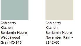
Andi and Neil's Cabinet Paint Color Options

Paint:

If you are going to go to the expense of having your doors professionally painted, you should choose a color that is unique, but timeless enough that it won’t look dated in a few years. For me, the go to for paint color inspiration is Sarah Richardson (from Sarah’s House, Sarah 101…). We used her own cottage kitchen as our inspiration for Andi and Neil’s kitchen. We decided to use Benjamin Moore Wedgewood (one of the colors that she used on some of her accent cabinets).

Different types of wood take paint and stain better than others. Our doors are oak and the refinisher warned us that we would not get a totally opaque finish with the oak, and should expect to see some variation. We actually preferred that since we still wanted the cabinets to look like wood. Typically a beech or maple will take the paint more evenly.

We used Delaware Valley Furniture Restoration (in Kennett Square, PA) and they typically charges $30-50 a door to refinish. They required drop-off but delivered the painted doors and trim. They wrapped the doors well (keeping the good side protected).  Also they were good about keeping the paint, so that we could have additional pieces painted, which was very useful since we ended up needing several extra pieces painted, due to several issues during construction.

Final Thoughts:

After going through this process and seeing the result,  I don’t know any other way of getting this look at this price point. If you are up for the hassle of getting the cabinet painted you too can have a custom look for a fraction of the cost of custom or even semi-custom cabinets.

14 Comments

I was VERY excited to stop over at Andi and Neil’s yesterday to see how things were going. So without further ado here is a peak (I will take more detailed photos once the kitchen is truly finished).

View from the Dining Room (looking south). Sink doors haven't been installed yet.

East Wall (missing cabinet doors are being painted). Look at the shiny refinished floors and the beautiful brick!

North Wall (stone tile backsplash will be continuous on this wall). You can also see the creamy wall color.

Close up of North Elevation w/ new Kenmore Slide-In Range

Beadboard Ceiling and Beautiful Schoolhouse Pendants

Detail of Brick w/ under counter lighting and granite counter

There are a bunch of miscellaneous items that need to be ordered and installed in the next couple of weeks but all of the big stuff is done! The contractors cleaned up most of their stuff yesterday (minus the paint cans for final touch up) and removed the tarps on the floor. They will be back once the last of the panels are painted and delivered, the handles and knobs are ready, and the tile backsplash is decided on and delivered. In the meantime, Andi and Neil can start using the kitchen! It is REALLY nice to see the kitchen without all of the construction clutter. And with another day or two of work it will be completely finished!

Handle choices (left is bright nickel, right is brushed nickel) & granite counter

I think we decided on the handles for the drawers, a traditional style handle with a brushed nickel finish (to coordinate with the faucet). We are still reviewing knob options. I think we should go with something fun and colorful for the knobs. They are at eye level and are the one thing that can be changed out quickly at a later point. For most of the choices on the kitchen we went fairly safe with the finish and coloring (which is good for items that you can’t change easily) but the knobs I think could start to bring some of Andi and Neil’s colorful style back into the room.

"Biltmore" Marble Tile in 2" Hexagon Pattern

"Biltmore" Marble Tile in Basketweave Pattern

Carrera Marble Subway Tile, 3"x6"

We are in agreement that we should use a marble tile for the backsplash behind the stove. The backup is to use a carrera marble subway tile but I prefer the hexagon or basketweave “Biltmore” Marble from The Tile Shop, but Neil is not convinced (at least not yet). I think we should be able to come to a consensus in the next few days though.

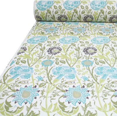
William Morris Inspired Fabric for Window Valance

We still need to look at accessories for the kitchen too. We all love this William Morris inspired fabric, that I think will make a lovely window valance. We also need to look at the space above the opening to the Sunroom and figure out what would look nice above there. I like the idea of vintage plates hanging or possibly a long shelf holding some fun accessories.

2 Comments

New Granite Counters with the Giant Farmhouse Sink Hooked Up.

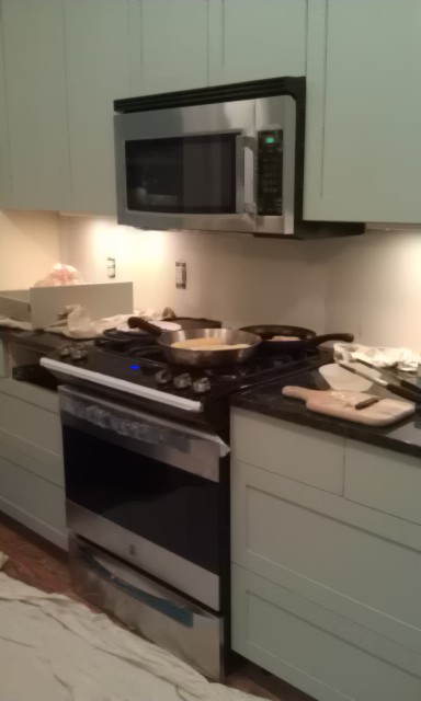
New Counters with Stove Installed

New Wall Color (creamy yellow) & new pendant lights

Granite Counter with Farmhouse sink sitting on it

So the day finally arrived, the counters have been installed! Andi took a couple of photos for me. I am going to head over later today to take some more photos and go over the last of the details. Also since the last time I was there, they finished up some of the trim and painted one of the walls. The contractors also managed to get the sink and stove hooked up today! I see that Andi already has a pan on the stove! I think there was a BIG sigh of relief over at Andi and Neil’s house yesterday. They can finally start using their kitchen again.

Items Left to Decide On:

-Cabinet handles for the Drawers
-Cabinet knobs for the Doors
-Tile Backsplash
-Accessories and window treatment!

We decided to hold off on these until the counters were installed. This way we can make sure that all of these coordinate nicely with the counters.  One item for debate is the finish on the handles. The lights are oil rubbed bronze and the faucet is nickel plated with a slightly rubbed appearance. Which finish do we go with? Or do we go more shiny for a little bling? We also looked at glass knobs for the cabinets. We will have to see what these look like now that everything else is in place. For the tile backsplash I am recommending a stone subway tile (possibly carrera marble). I think a plain white tile may look to stark with everything else, but again we wanted to wait and see how the granite looked first (especially since this doesn’t have to go in to make the kitchen function).
 

Leave a comment

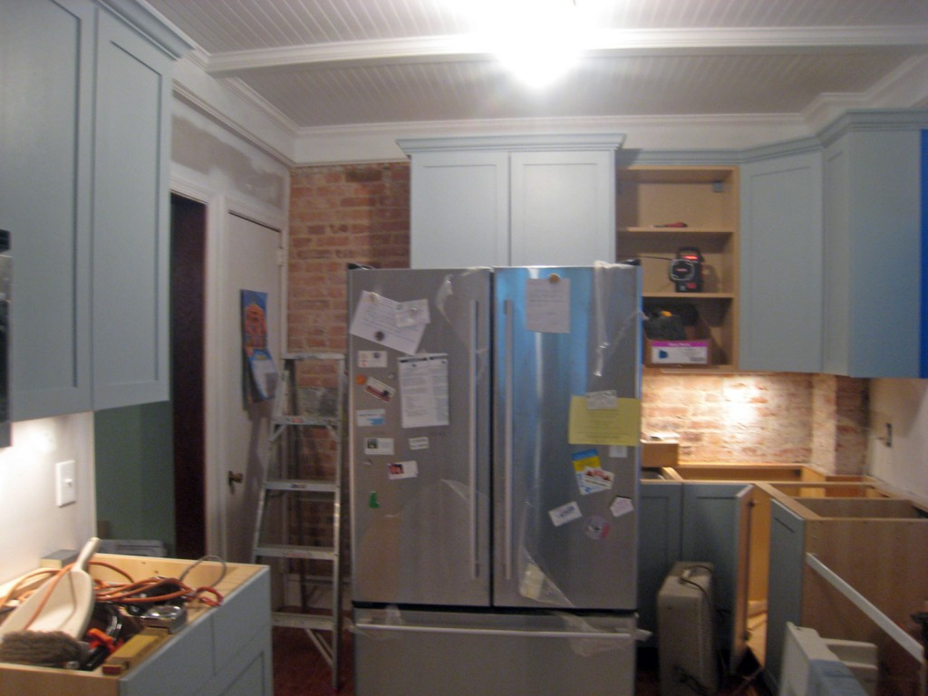
East Wall: The fridge is currently pulled out so it looks more jumbled then it actually is.
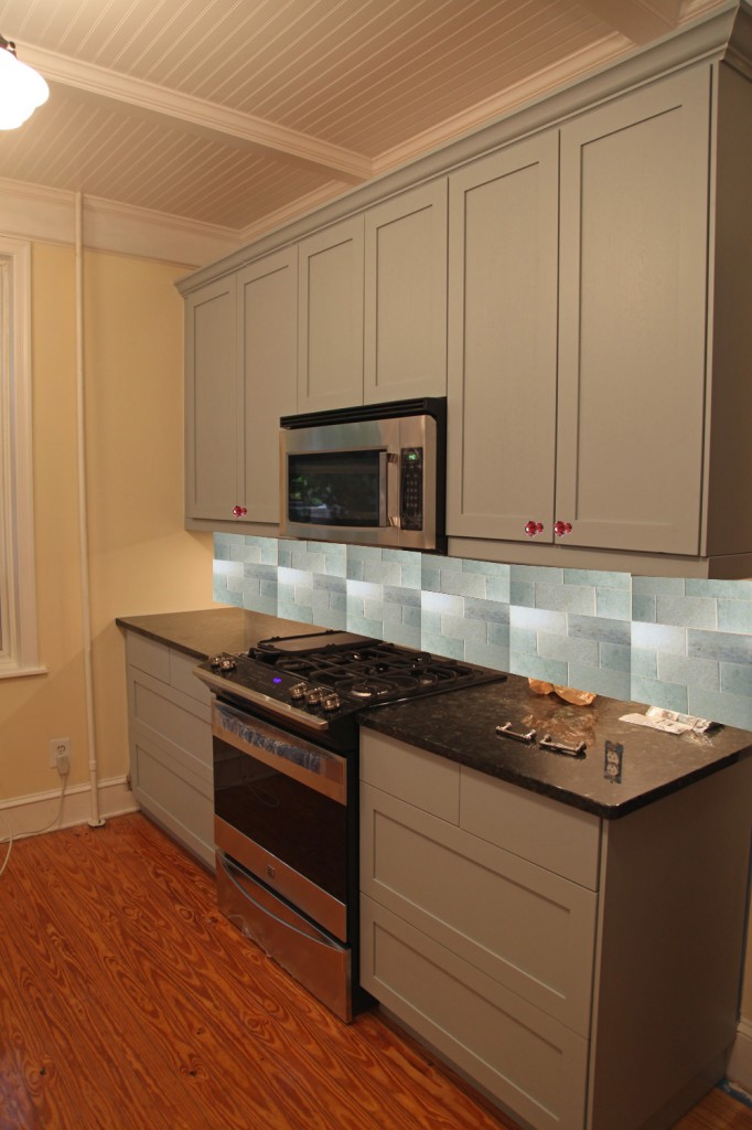
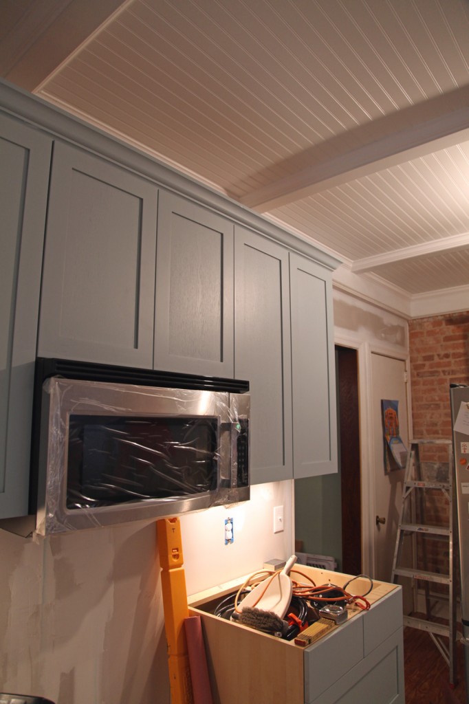
North Wall w/ new microwave (the trim for the underside of the upper cabinets has not been installed yet)

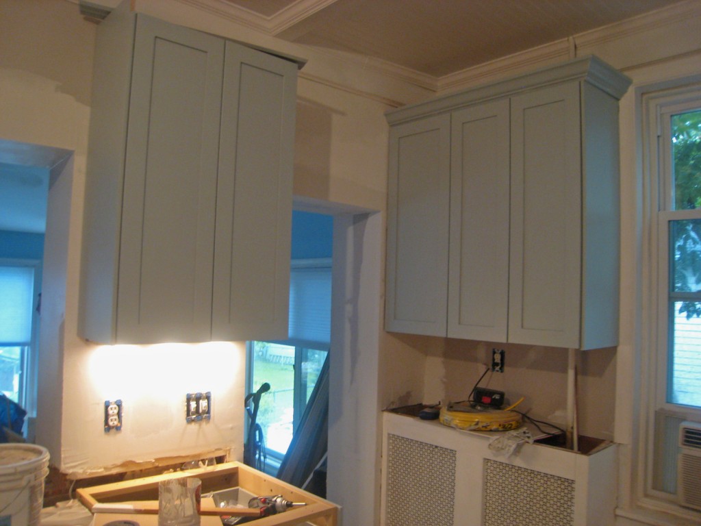
West Wall w/ new window casing

Southwest corner (need to pickup butcher block for the existing radiator cover)

Detail of Cabinet w/ brick and beadboard ceiling. I think the combination of these look great together! (touch up painting for the crown molding still needs to be done)

I stopped by Andi and Neil’s house yesterday to see how things were going. They are getting close to being done! The cabinets and trim look fabulous thanks to all of Chris & Kent’s hard work.  The to do list is getting much shorter and the end is almost in site (although I’m not sure Andi & Neil would agree with this right now). The countertops were templated last Friday, unfortunately we are looking at another 1-2 weeks before they can actually be installed (it appears that one of the downsides of using the Ikea countertop companies is that their cue is quite long). The contractors will be finishing up most of what they can do until the countertops are installed today.  The items left on the list:

Miscellaneous Trim:

-Undermount trim for the upper cabinets (we need to get the clips for these, for some reason Ikea didn’t supply them like they should have).
-Missing side panel for one of the upper cabinets (we need to get this and then have it painted)
-Last of the crown molding for the upper cabinets (waiting for missing side panel)
-Make removable side panel for fridge. This will have a tackboard on the upper part and a chalkboard on the lower part.
-Pick up last set of doors and drawer fronts at painters

Walls:

-Finish Priming Walls (scheduled for today)
-Paint walls creamy yellow

Floors:

-Finish sealing wood floors

Ceiling:

-Install pendant lights (after a couple of weeks on backorder they are finally ready to be picked up at the store)

Countertop:

-Install countertop
-Pick out small piece of butcherblock for counter above radiator (possibly at Home Depot or Ikea)

After countertop:

-Install sink and dishwasher
-Install range
-Patch walls after counter in installed around opening to Sunroom

Miscellaneous:

-Decide on knobs for upper cabinets and handles for drawers. We decided to wait on this until we see the countertops in place.

Backsplash:

-We decided to wait on this until the counters are installed.  Tile will go on the north wall backsplash behind the stove.


2 Comments