Archives For -Dining Room

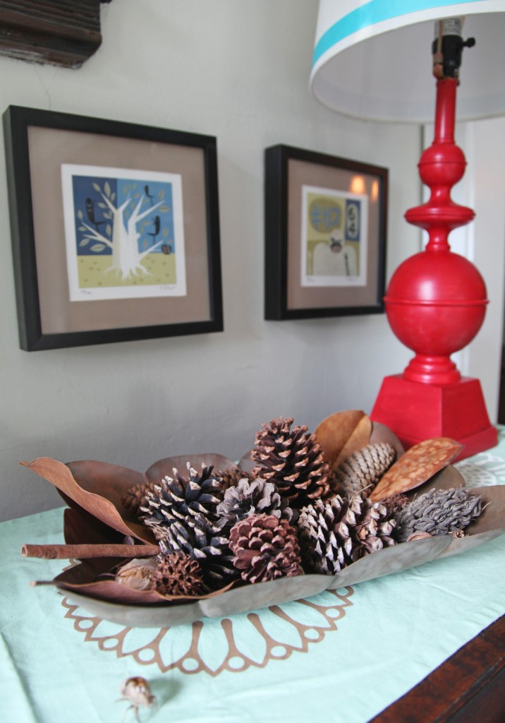
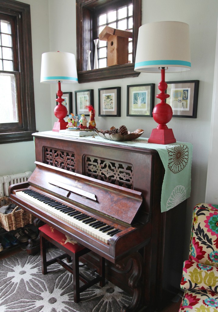
Piano w/ newly painted red lamps and kids artwork

I hope everyone had a good weekend! I have been feeling more motivated the last few days. I’m not sure if it is the cooler weather, the deadline for getting images together of the house or the hint that fall will be here in a couple of weeks, but I am going to try and keep it going for a while longer.

The piano area in our house is a prime candidate for clutter and until now didn’t have anything in particular on top except for one small lamp (which has been relocated to the kids play area upstairs). This landing zone is where we come in and out of the house most days and the area often becomes cluttered with stuff, particularly the top of the piano and the floor space around it. In my quest to make the piano area more polished looking, I bought 2 new lamps for over the piano last week to add some height. Over the weekend I managed to paint them and add ribbon to the lamp shades.

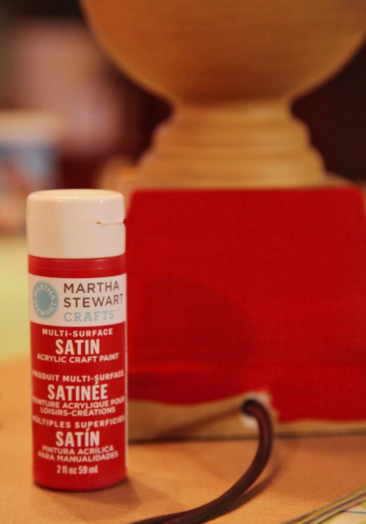
Martha Stewart Craft paint in Tartan Red with a Satin Finish, $2.99

I headed over to JoAnns to see what they had in paint. I was originally thinking that I would use spray paint, but I didn’t want a gloss and the choices in satin and matte were not so good. So I decided to take a look at the craft paint. I liked the look of the Martha Stewart craft paint (in Tartan Red) and decided that for the price it was worth a try. I also thought it might work better anyway because the lamps already had a slight brushed texture to them. Fortunately, the paint went on well in one coat. It was really easy because I just squeezed the paint right onto the brush, so clean up was super easy and I only used about 2/3 of the small container.

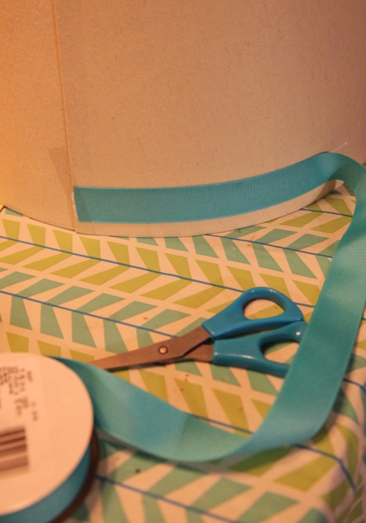
Gluing Grosgrain Ribbon onto the Lamp Shade

I also picked up some aqua grosgrain ribbon for the lamp shades for $3.99. I decided to try gluing it directly to the shade with craft glue (Alene’s Original Tacky Glue). I started at the back and used some scotch tape to hold it in place. Then in about 9″ increments I added glue to the ribbon and pulled it tight. Keeping it tight is key because the lamp shade is slightly smaller on the top then the bottom and it will pucker on the top if you aren’t careful.

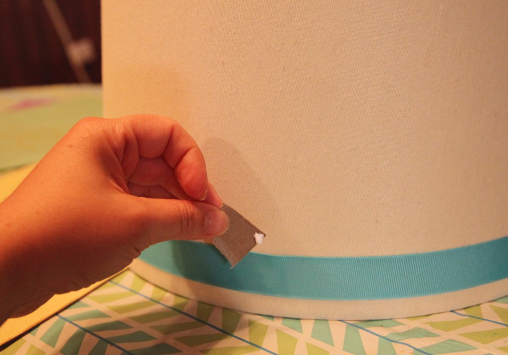
Fixing a couple of spots on the ribbon

I had a couple of spots at the top where I needed to add more glue. I took a small piece of cardboard and carefully put a little bit of glue in the gap and pushed down with my finger. Then I waited over night and put them back on the piano the next morning.

Piano with new lamps and accessories

So now that the lamps were done it was time to add some more accessories. I started with a table runner by simrin that I bought a couple of years ago. I really like the color and pattern, but find that I don’t use it very often with the kids.

The kids birdhouses and a few of Sam’s treasures from Artcamp

I had already decided that I wanted to feature some of the kids artwork on top. I found an old brass (?) plate that we had and added one of my favorite books (Pattern by Orla Kiely).

Copper bowl filled with the kids nature display (cicada shell in foreground)

Next I  added a copper bowl filled with the kids “nature display”. We let the kids collect pine cones, leaves, pebbles and cicada shells and had been putting them on a small tray that was getting too full. This new bowl works well.

I have also added a new basket (from Homegoods) that sits on the adjacent shoe rack, to hold miscellaneous stuff.

Next on the list is new valances to match the ones in the Dining Room. I sewed them over the weekend, but I still need to pick up the wood and brackets to finish them up.

So far I am really liking the red lamps and new bit of color to this corner of the house. What do you think?

Leave a comment

New Chair

July 16, 2012 — 1 Comment

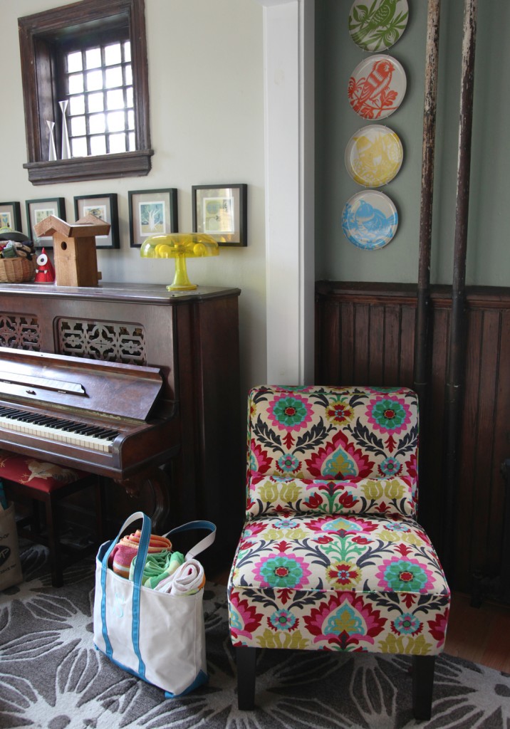
New Chair from One Kings Lane

I hope everyone had a good weekend! We had a pretty relaxing weekend, although I don’t think I am quite ready for the week. I realized that I haven’t shown you my latest chair and its new home.

So I bought this chair a little while back thinking that it would go in our Master Bedroom. Well, we are still a long way from working on that space, so it was in the Living Room, until we did some rearranging and I moved it to the Dining Room last month. I like it in here so much that I think it will stay here for  a while and  I might need to look for a new chair for the bedroom.In its new location it is a good resting spot for putting on shoes or sitting and talking to someone while they are on the computer (which happens more than I would like).

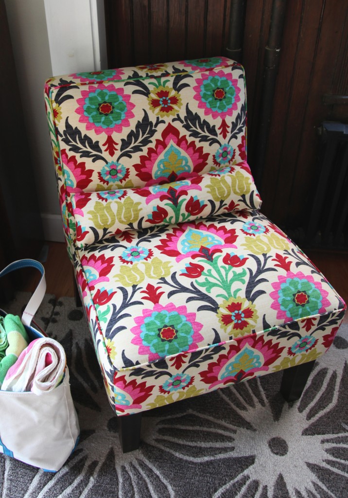
Chair in Waverly Santa Maria Desert Flower

The chair was from One Kings Lane is no longer available, but the fabric is “Waverly Santa Maria Desert Flower” and is $19.99 a yard. They also have a coordinating zigzag and flower fabric, and it comes in a couple of colorways. I really do love the fabric. It is so fun, but it is definitely a statement piece.

P.S. I have some new exciting projects in the works, which I hope to share soon. I hope everyone has a good week and stays cool!

1 Comment

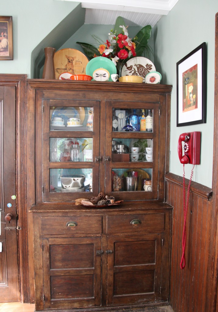
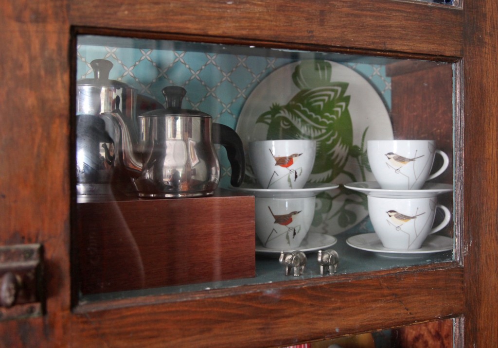
Built-in Dining Room Hutch circa 1920 with new Glass Doors

One of the house projects that we wanted to finish before Sam’s Birthday Party were the doors on our built-in hutch in the Dining Room. This is not original to the house (built in 1888) but probably installed in the 1920s. Originally this was the alcove where the cooking stove was located (the brick is still behind this hutch) but since it has been here that long, we wanted to keep it. The previous owner striped off the paint and I repainted and papered the inside several years ago. The intention has always been to cut out the wood panels on the upper doors and put in glass. Well the doors have been sitting here for years waiting for that to happen. So last week Mr. S. went to work on them! I voted for the router, but he was concerned that it would damage the doors, so he went the route of carefully using a utility knife to the back of the doors (they are pine so they are fairly soft). He carefully took the back of the tongue off the frames and took out the wood, over several nights. Then he installed glass (Lowes will cut glass while you wait) with glazing caulk and painted the inside of them to match the blue (which is also the same blue as our kitchen island and bench).

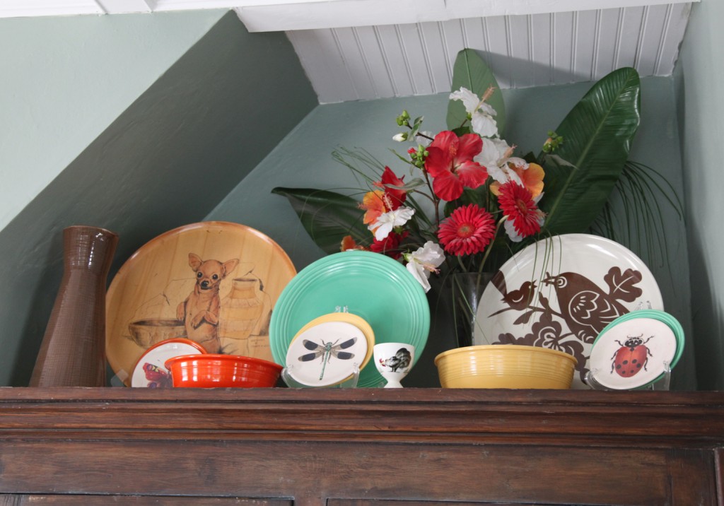
Top of Hutch w/ Vintage Fiestaware mixed with new Plates

I dusted off everything in the cabinets and moved some stuff around. I also added some more plates and bowls on top of the hutch. I am definitely not an expert in arranging stuff but I am liking the additional color from the Fiestaware. These colorful plates and bowls were my grandmother’s (as is the chihuahua platter). The pitcher is from the Orla Kiely line at Target a few years ago. The big bird platter is Thomaspaul and the small plates are from John Derian line at Target a couple of years ago.

Close Up of Dining Room Hutch w/ Charlie Harper Tea Cups

There is more glare than I was expecting from the glass, but I am really liking that the doors are back up and it is looking more finished. I still need to tile the random little bit of floor in front. It is concrete (from the original cooking stove), so our floor installer didn’t want to put wood on top. We have tile that matches the tile behind our stove all ready (it has been waiting even longer than the doors).

Leave a comment

Backstairs in the Dining Room

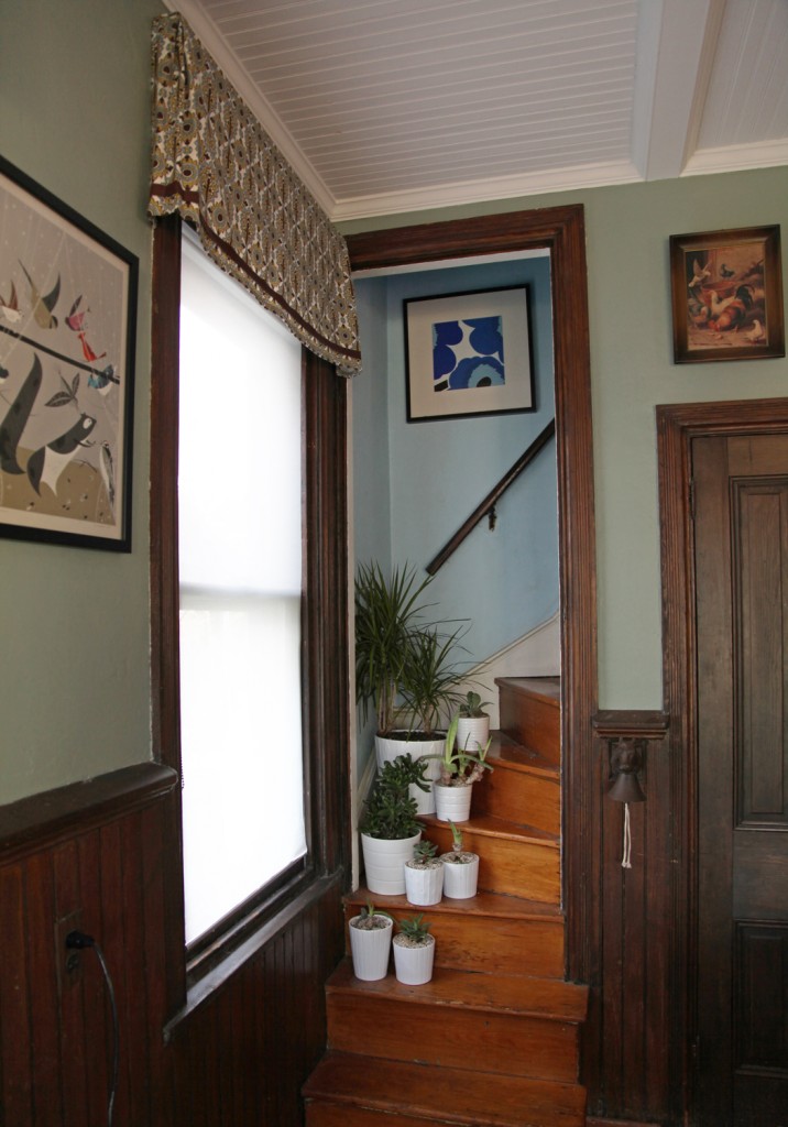
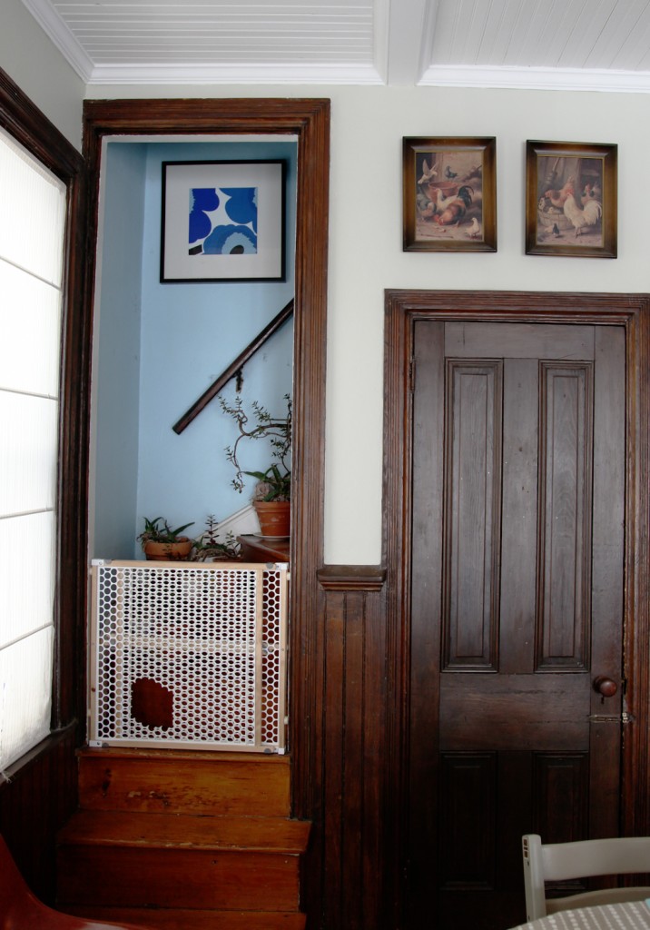
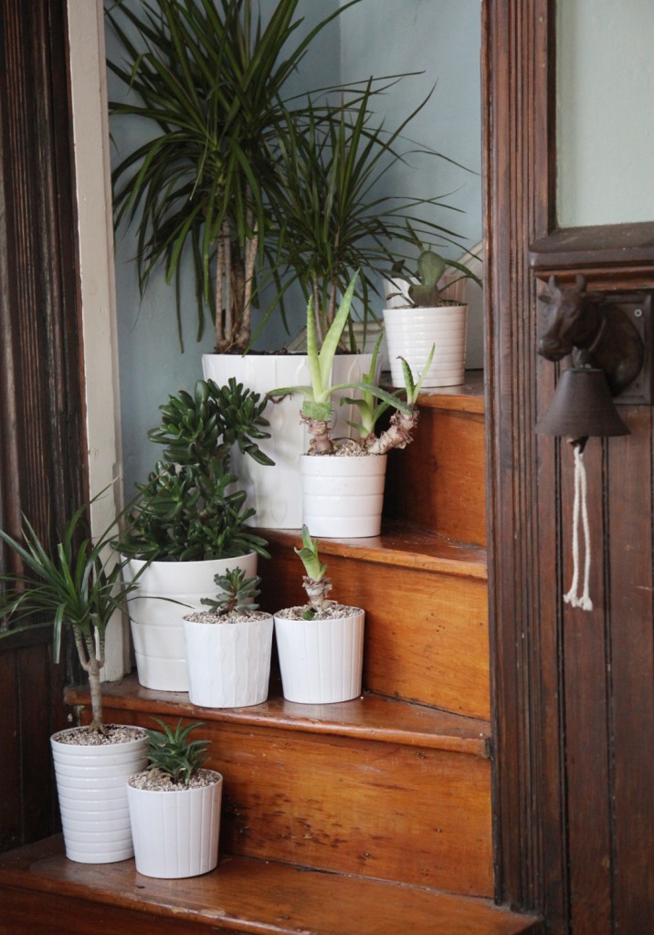
The backstairs (aka the cat stairs) go from the hall upstairs to our Dining Room. Originally our Dining Room was the Kitchen, which theoretically makes these the “servants” stairs. I don’t think our house ever had servants given our house’s location and size, but I suppose maybe these were handy for the kids to go up and down. We have had a baby gate on ours for the last 3+ years (with a hole cut out for the cats). The kids are good about not trying to use the stairs, so we thought it was okay to take down the gate. It has been down for a few weeks and so far so good. Now time to pretty them up! I have put some of my indoor plants on the stairs for the last several years, since it is a nice out of the way spot (and we rarely use the stairs ourselves). The plants go out on the porch in the warmer months, so it is really just for the colder 6 months of the year.

The Backstairs with Babygate (before the walls were repainted)

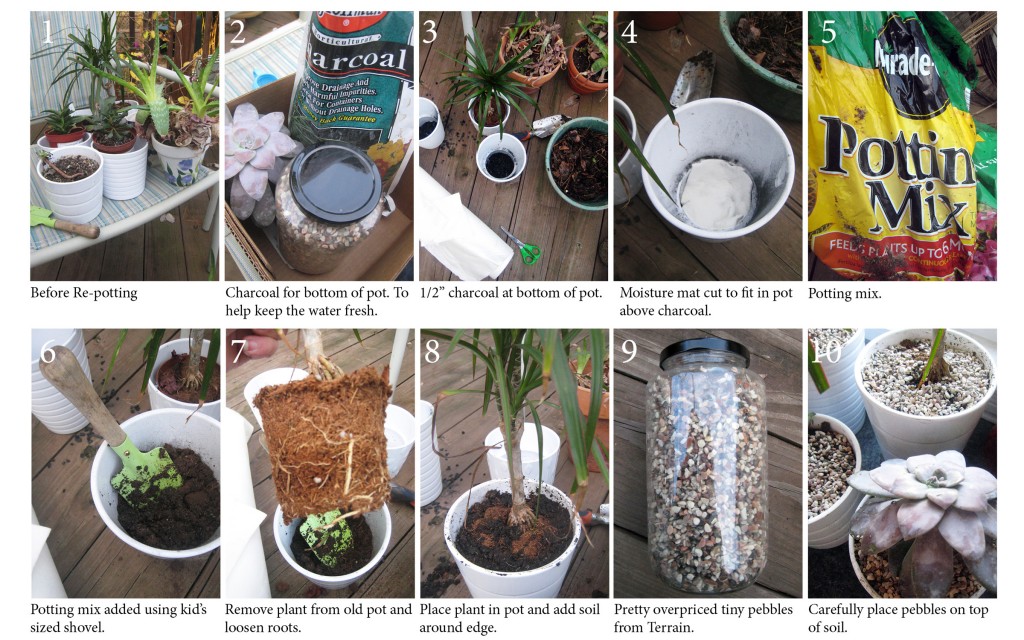
The random pots were looking pretty sad, and I was way over due in re-potting some of my succulents. So a trip to Ikea was in order to pick up a bunch of white pots (Kardemumma) in several fun patterns to brighten up the corner. I should note that although I have a pretty extensive perennial garden, I am not blessed in the art indoor gardening. My mother has an amazing selection and all seem to thrive, but I have killed more than my fair share of house plants. I now stick to almost all succulents (and a couple of dracaena marginatas), since they enjoy being neglected. I have several aloe plants already (also convenient for burns) and a couple of other random plants. I picked up a few more at Ikea for $1.99 & 2.99 to create a more interesting mix of textures and colors. I also have a couple from the Tropical Sale at Scott Arboretum this spring.

When I stopped by Terrain a couple of weeks ago I admired their pretty collection of succulents. I saw that they had a charcoal product for putting in the bottom of pots that don’t have holes, to help keep the water clean. I prefer not having to deal with saucers with my pots and thought this was worth a try. It does mean you have to be careful not to overwater, otherwise you still risk rotting the roots. I also used a moisture mat which helps keep the extra water in place and slowly releases it back into the soil. For the soil I used standard potting soil amended with peat and sand. Once I got going it didn’t take too long to get everything replanted.

I am still working on the exact placement of the plants, but I am much happier with this corner now! The only thing that I have to remember now is that I have to pull up the roller shade to get more light in every day. The one disadvantage of a solar shade is that it blocks enough of the light that the plants were starting to look pale. We will have to see if I can keep these plants alive!

New Pots and Plants on the Backstairs (and adjacent cow bell)

We will have to see if I can keep these plants alive!

Leave a comment

New Desk Chairs

October 19, 2011 — 4 Comments

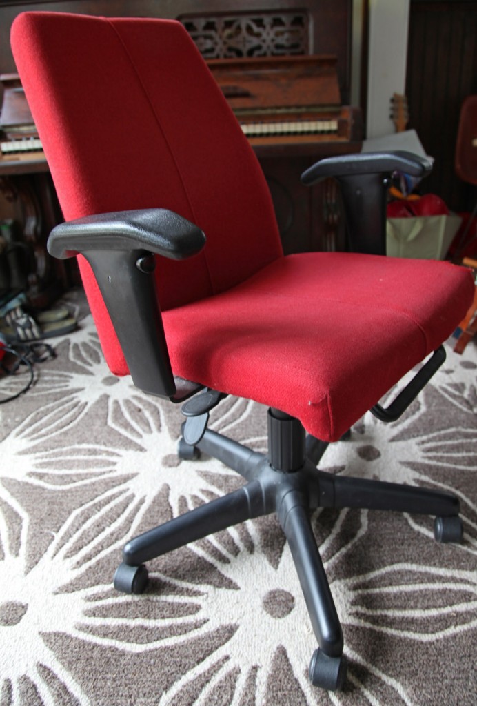
Our old Ikea Office Chair, it has provided many hours of comfort!

The desk chairs that we use at our desk in our alcove off of the Dining Room are showing some (okay a LOT of wear). The main chair has had a hole in the front corner for a couple of months but now the foam has started disintegrating at the front, leaving a not so attractive pile of dust underneath it. Yuck! We have had them for quite some time (at least 8 years) and we bought them on sale at Ikea, so I feel like we have gotten a good return on investment and it is time to retire the most well loved chair and move the other one upstairs to my “someday” office. Of course when we bought them we actually had an “office” set up in one of the bedrooms, so comfort trumped style. Now a days our desk is right out in the open, so we need something that is still comfortable, but also has some style! I did some searching on the internet to see what my options were and was surprised at how little I found that met my parameters, and how expensive most of them were. I didn’t think this would be so difficult and if I am going to spend a few hundred dollars on one, it better look great and be comfortable!

Desk Chair Requirements

1. Comfortable (i.e must have upholstered seat and back and ideally adjustable)
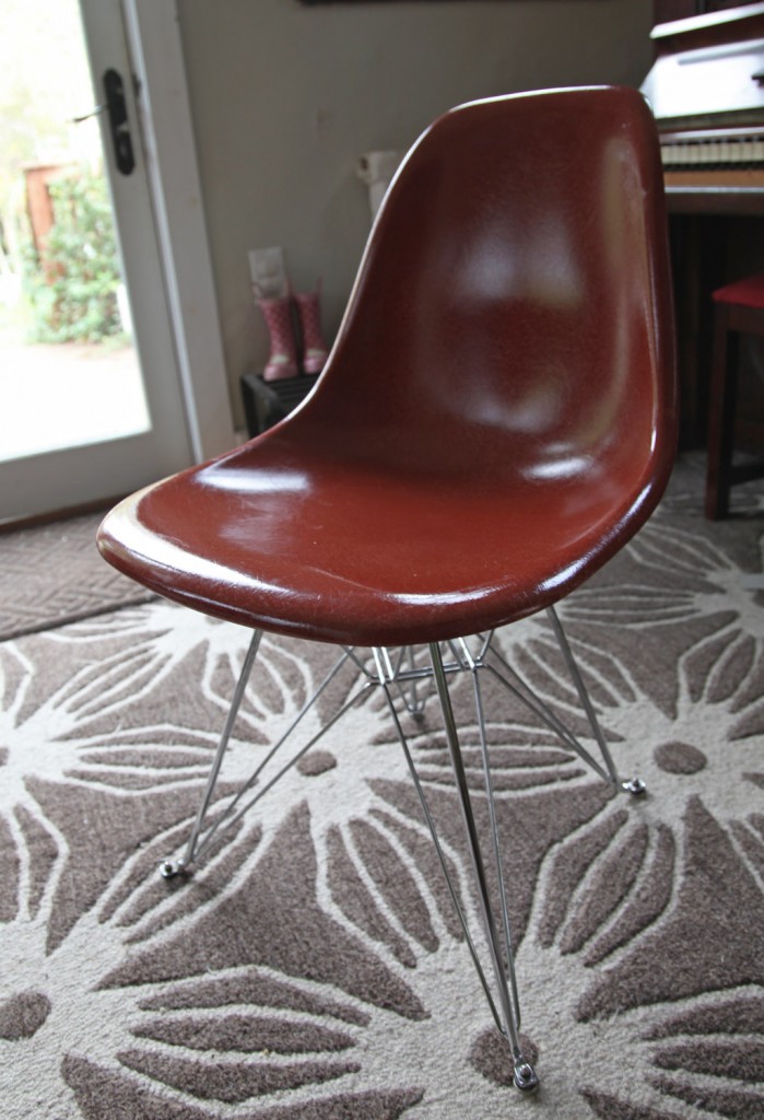
2. Stylish! Something vaguely retro that can coexist with our fiberglass shell chairs.
3. On wheels!
4. Arms that aren’t too big (or none at all) so that at least part of the chair would fit under the desk.
5. Durable enough fabric for 2 kids and someone who has a habit of spilling coffee (that would be me).
6. A matching pair.

So far there is only 1 in the running, and it will require reupholstery!

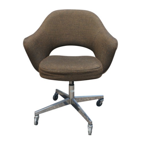
Vintage Saarinen Executive Chair by Knoll

So after a brief search on my normal go to shops (overstock, pottery barn, ballard design, west elm, crate and barrel, cb2…) I decided to look on ebay. Pretty quickly I found the above chair and I was in love. This is a vintage Saarinen “Executive Chair” by Knoll. They still make these with a slightly different base (at a price of about $1600!). The vintage ones vary drastically in price and some are knock-offs. I am actually finding it very difficult to tell the difference between the real ones and the fake ones. I think this is partially due to most of them being reupholstered and there does not appear to be a good permanent tag. They vary between about $200-800 depending on condition and whether they are claiming that they are original. I think I will probably want to reupholster anything we get with a durable fabric, so I am thinking about buying them as cheap as possible with the goal of reupholstering them. Of course then I will need to find a durable but cool fabric (because with this shape it deserves an awesome fabric!). Maybe even possibly a retro Knoll fabric in an interesting color.  I think it will play nicely with our Dining Room Fiberglass Shell Chairs (by Modernica)…

Modernica Fiberglass Shell Chair (based on the original Eames Chairs)

What do you think?
4 Comments

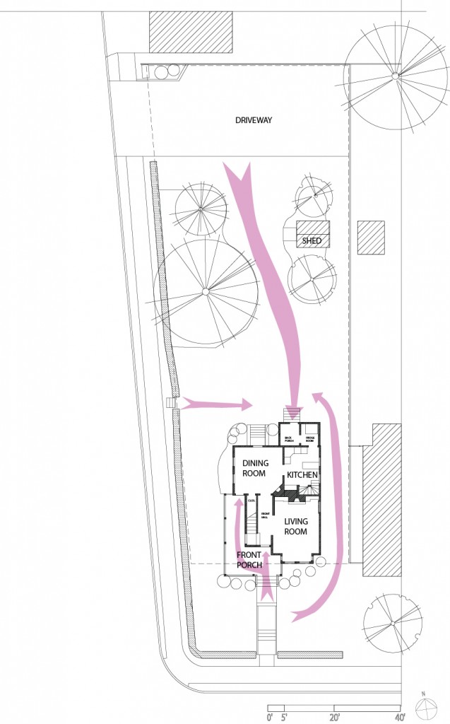
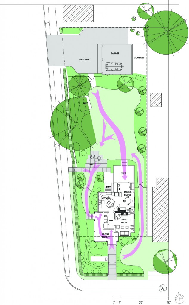
I thought it would be helpful to show everyone the original siteplan and first floor compared to the the current configuration. I also added some arrows to show the connections and pathways through the yard.

House Circa 2000:

-The only landscaping where some overgrown shrubs in the front yard and a large pine tree, dogwood and birch tree in the backyard.

-The Yard slopes down significantly towards both streets. Mr S. wiped out several times trying to mow it.

-The Entrance at the back of the house was not very welcoming or easy to use. Through the back porch and refrigerator room to the kitchen. Yuck!

-The Front Porch was nice, but very exposed to the street and had no side entrance.

-The Kitchen was tiny and the fridge was in an unheated adjacent space. The layout was horrible (it included 3 doors, 2 windows and a back staircase). The connection to the rest of the house was poor. You couldn’t see the backyard from the space.

-The Dining Room was really large, but not very well used.

Current Configuration:

-The landscaping has limited the grass to walking areas and play areas. Lots of perennials, shrubs and trees have been added to provide privacy, add visual interest and to encourage butterflies and birds.

-The House has been opened up to the backyard, providing better light and visual connection.

-The Kitchen and Dining Room switched places, providing us with a large kitchen and a smaller but functional Dining Room.

-We reconfigured the back porch/refrigerator room to be open and have a built-in desk space as well as a space for the piano.

-We added a patio and deck to the backyard to better utilize the space.

-We finally added a second set of steps to the backyard from the porch. Now we can go from the front to side yard and also from the kitchen to the backyard easily. Why did it take us 11 years to do this. hmmm…

Leave a comment

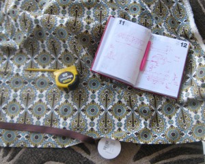
The Valance Fabric and My Sketches for the Design

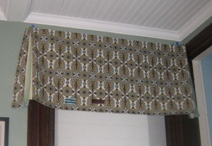
The top corner of the valance with staples

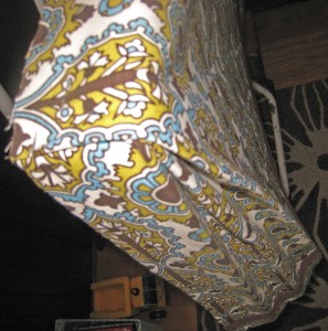
The pleat on the corner

The Backstory:

When we bought our house it was full of frilly curtains everywhere. One of the first things I did was take them down. They blocked a lot of the light and were needless to say not my style.  For a long time we relied on semi-sheer curtains and blinds (or nothing at all). Now that our style is a little more defined, I feel like the windows could use a little punch.  However there are two issues that we keep running into. First is that I do not want to hide all of the window molding (this is partially why we bought our old house) and second is that we have a radiator under almost all of our windows limiting the placement of curtains.

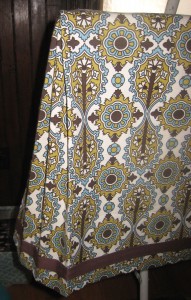
Test valance: too long and the contrasting fabric in the pleat didn't look good..

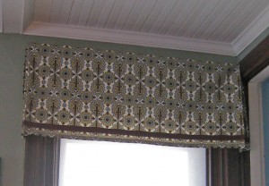
First Valance Finished!


The Design:

When I think of valances the first thing that comes to mind are very fancy frilly window dressings. That is not what I had in mind! I put up valances in my daughter’s room a couple of years ago. These were made out of Orla Kiely dishtowels (from Target). It was a really inexpensive and easy project, so I thought I would do something similar but a little more tailored. I looked online for tutorials and only found 1 that I liked. Pam from Bibbidi-Bobbidi-Beautiful (via Little Green Notebook) made a beautiful curtain/valance out of a king sized sheet. I liked the style a lot but I did not like that she installed the valance with duct tape on cardboard. So I took her inspiration and made mine using a 1×3 piece of pine for structure a the top and attached it to the wall with 2×2 angle supports.

For the fabric, I wanted something that would pick up the blue color on the kitchen island and the dining room hutch, while also looking somewhat Victorian. I also needed something that would go with the new rug. In the end, I selected this beautiful fabric called Elizabeth in Chocolate.  The ribbon is from JoAnn’s  and is a simple 1″ wide brown ribbon.

The Install:

1. Determine the height and width of the valance. I marked the proposed height with a piece of painter tape before deciding on the height. I decided to go 1/2″ wider on each side of the window trim. Because these windows do not have rosette corners I didn’t mind covering up the top of the window. Also I recommend mounting it a few inches above your window to make the window appear taller (I mounted mine about 7″ above the window frame and aligned it with the door frame for the back stairs). In the picture on the left you can see that in the first version it was too long (about 21″) I used the entire width (about 55″)  of the fabric and used the excess width in the pleats. In the end mine are about 18″ high.

2. Cut 1×3 pine to proper length.

2. Cut fabric (keeping in mind that if you are using a pattern with a horizontal repeat that you may have to cut some extra fabric to make sure that the pattern aligns in on all of the valances). I also kept the selvage on and turned it under on the side the seams).

3. Iron seams for the 2 ends. Iron the seam for the bottom.

4. Sew the 3 seams.

5. Iron on the ribbon detail with iron on tape (you could also use fabric glue or sew this on).

6. Iron the pleat locations. I used the wood as a template and  marked the fabric with a pin for the corners. You are going to be making “hospital corners”. To do this locate the corner of the side and front. Then fold the remaining middle fabric in half. This spot will also be at the front of the pleat. You need to make basically make a w shape with the fabric. I then ironed this flat and pinned them all together.

7. Staple the fabric to the wood with a heavy duty stapler. I tacked one staple in the middle first then start on one side. First I tacked the side part at the right spot. Then I placed the remainder of the corner pleat on top and fidgeted with it until it was aligned to my liking. Then I stapled over the corner. Repeat on the other side. Then fill in will staples across the top.

8. Attach 2 2×2 angles to the 1×3 pine (you could also do this before you put the fabric on) with a 1/2″ long wood screw.

9. Locate the valance on the wall. Mark holes for wall screws.

10. Install mollies or whatever works best for your wall. In my case because they are so light and I have plaster walls. I just used a 1″ self tapping wood screw.

11. Screw into wall (you may want someone to hold the valance why you do this).

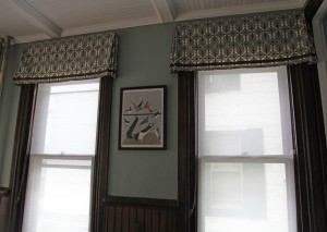
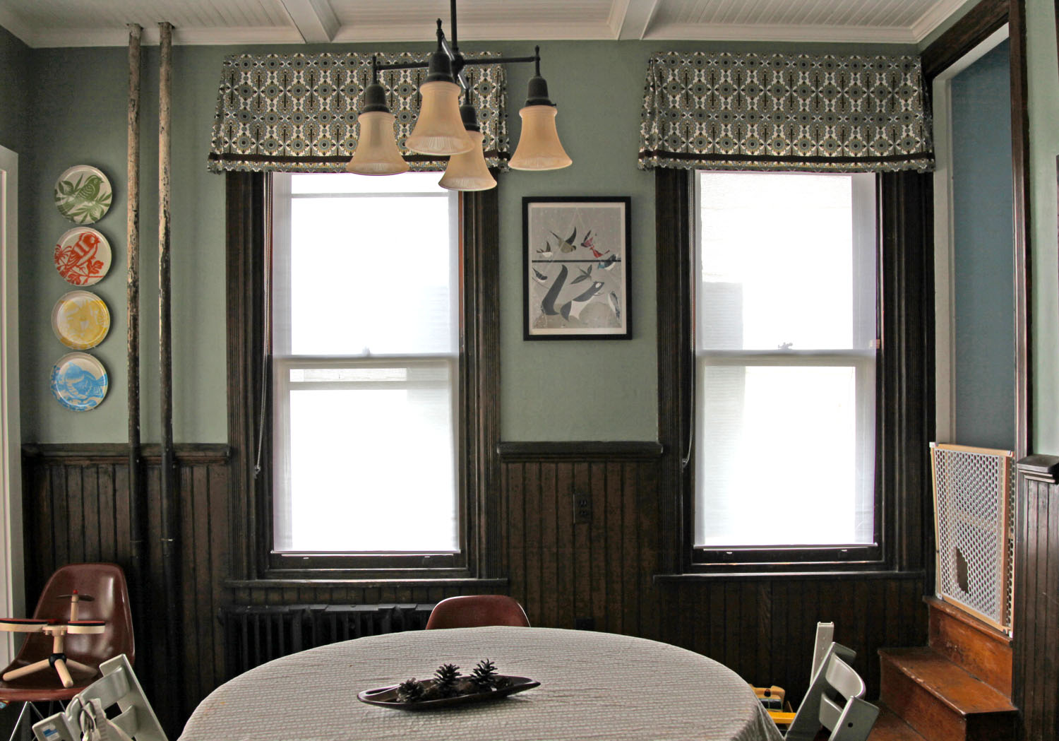
2 Windows in the Dining Room with a Charley Harper print in between.

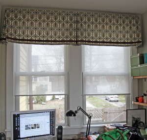
Double valance over the Desk Area. This required 2 pieces of fabric sewn together and hidden in the middle pleat (please pardon the appearance of our desk).

Dining Room w/ new paint, solar shades and Valances (The child gate is an evil necessity with a set of back stairs like ours. The hole is so that our cats can get through.)


2 Comments

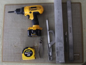
Tools you will need (not shown, painters tape and scissors)

I have been so busy thinking about and working in the yard that I have not made as much progress on my Dining Room as I would have liked. I did manage to mostly finished the window treatments a little while ago. I thought I would give a quick rundown.

The Background:

Our old roman shades had been recalled from Ikea a while back because they were considered a choking hazard. We cut the cords on the back rather than taking them down, since we did not usually open them anyway. But they were still looking pretty dingy after many years of service (including when this room was our kitchen).


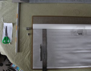
Shade taken apart for cutting. I used the self-healing cutting mat with a grid to help make a straight cut. Because the fabric is semi-sheer I could see the grid behind.

The Roller Shade:

I didn’t want to pay for custom roller shades so I looked at Ikea for options. I found the ENJE solar shade (semi-transparent) but of course it wasn’t the right size and I really wanted an inside mount fit so we wouldn’t cover the window molding. After a little searching online I found that several people have “hacked” the ENJE shade to custom sizes.  Check out Door Sixteen for her full details with lots of pictures (which she unfortunately didn’t post until after I had already cut mine).


The Install:

1. Buy ENJE shade in a width wider than what you need (for my 30″ windows I bought the 32″ wide for $24.99)
2. Figure out the width you want including the hardware.

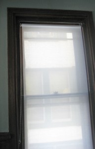
Shade installed in first window.

I had to subtract about an 1 1/2″ from the clear width to the final fabric width to include the chain mechanism and the mounting hardware.
3. Carefully disassemble the shade. This includes taking off the bottom rail and the mounting hardware on the top with a wrench or screwdriver.
4. Cut the side of the shade fabric with an exacto or scissors (see picture).
5. Cut the lower rail with a hacksaw.
6. Cut the upper rod with a hacksaw (protect shade fabric with painters tape). I managed to gouge my finger doing this so be careful.
7. Reassemble.
8. Hang. (you will need wood screws for this since Ikea does not provide them).

The first one took me about an hour and a half. The rest took about 45 minutes. I have finished 4 windows and I am still debating whether to put shades on two of the smaller windows. i really like them. They are unobtrusive but provide a nice amount of privacy.

1 Comment

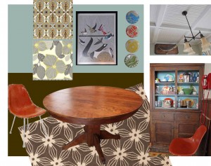
Mood Board: New items include carpet, fabric for valance, and wall color


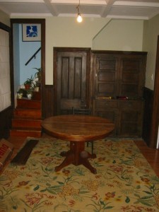
Dining Room circa 2007

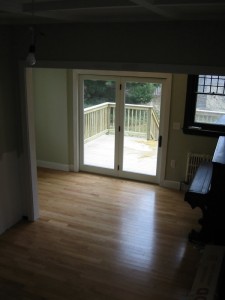
Dining Room looking towards back of house

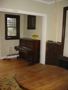
Looking from back stairs


2011-Dining Room (with splash mats)

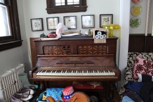
2011-The piano as dumping ground.


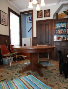
Our Dining Room/ Study/ Piano Room is in need of a little love. We renovated the former kitchen, ice box room and back porch into the Dining Room 4 years ago (while I was pregnant). This included opening up the back of the room to the former ice box room and back porch, adding a “bay” for our desk, putting in french doors and replacing the wood floor. We had a contractor do the big stuff, but we designed and built the beadboard ceiling, we replaced missing wainscot, built a desk and we painted the room.  We were excited to have a functioning Dining Room again but never got around to making it everything we wanted. Now with 2 small kids, we needed to rethink the space.

Stats:
The “room” is actually 2 rooms divided by a large opening.
-Dining Room: 11’x10’6″
Uses: Dining, Arts & Crafts, Circulation, Storage
-Study/Piano Room: 7’x14’L
Uses: Desk, Piano Playing, Toys, Entrance to the driveway, Shoe Storage

Current Problems with the Space:
-Lack of cohesion between the Dining Space and the Study/Piano Space
-The Study/Piano Space is feeling cluttered, especially with the kids toys and shoe pile
-The rugs are looking pretty shabby (the floral sisal rug in the
dining room is 10 years old and is showing its age)
-The Ikea shades in the Dining Room are torn from the kids & cats. Plus we had to cut the cords on the back because of a recall.
-No shades in the desk area

Goals:
-Find a rug with an interesting pattern, that is continuous between the 2 spaces
-Repaint the walls a more saturated color
-Find a window shade solution, that minimizes the view to the
neighbors house but still lets in light. Use coordinating shades for
the desk area.
-Find more storage  for kids toys, arts & crafts & office related items
-Refresh the colors and artwork in the spaces

Leave a comment