Hi All! Well we finally decided to go live with the new look for the blog. Mr. S. deserves most of the credit for this one (Thanks Mr. S!). A lot of the work is actually on the back end. So in addition to a new logo and appearance the blog now has responsive design which is really cool and means that it should work well on phones and tablets too (which is 100% Mr. S.)!
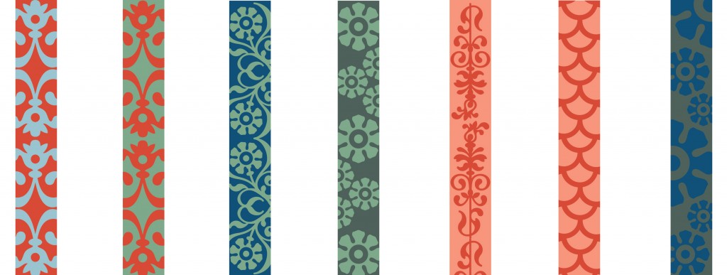
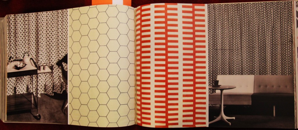
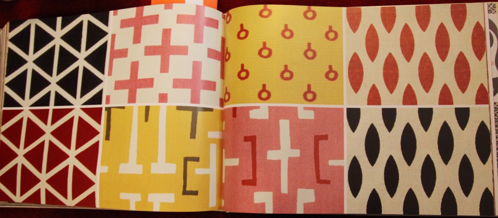
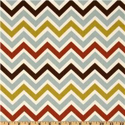
The biggest change is probably the new logo. Which took lots of back and forth and I think is quite beautiful. We have also added a white background, which is departure for me but I think it work well for highlighting the content. We also added a colorful border with different patterns that vary (because I need to have my color and pattern somewhere).
I still have a bunch of stuff to add including a new picture of me (in progress), social media links, a links page and most importantly a full house tour. Since the blog with have its 2 year anniversary at the end of the month, I hope to have all of that up and running by then.
We have come a long way in the two years since we started. I hope you enjoy the new look!
And a special thanks to all of my readers who keep me inspired! xoxo


