Archives For -Cottage Style

Basement Beadboard Ceiling Details

The most popular question I get on my blog, is about the beadboard ceiling in the basement. I have promised to write a more detailed post. So here it goes…

I am become sort of a beadboard expert over the years. I didn’t start out this way, but our house is old and already had a good bit of beadboard, and I have had to patch some over the years as well as installing new. Beadboard and wood planking comes in all sorts of sizes and dimensions and range in price from totally affordable to kind of expensive. I’ve used a bunch of different varieties for different uses. In the basement we have used 3 different types.

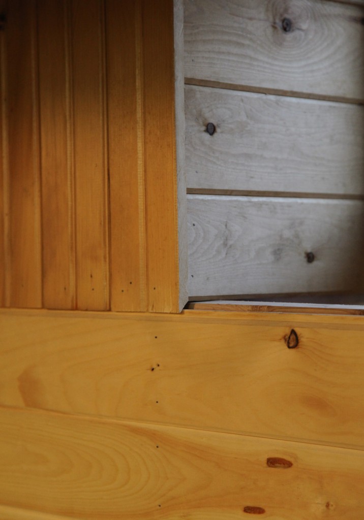
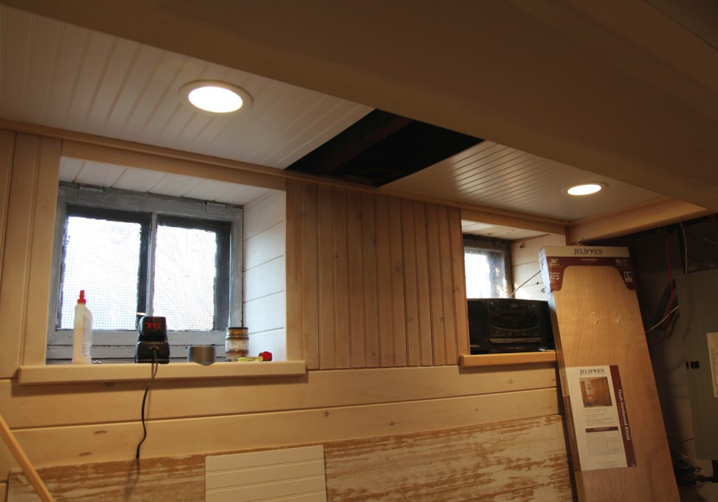
Beadboard Detail at the Window

1. Walls: We used a classic full size tongue and groove beadboard for the walls. This is 3/4″ thick and approximately 6″ wide. One one side there is a “bead” in the middle and on one end, giving you about a 3″ repeat. On the back it is smooth with a simple v-groove at the joint. The basement already had some of this board on the walls, so we actually salvaged what we could for re-installation. The nice thing about this is that you don’t need any backup. This is strong enough to act as the wall surface. It is simply nailed to the studs. This is also what is installed on our porch roof (which is what this type of board was originally meant to be used for). Fortunately Home Depot sells it in 8′, 10′ and 12′ lengths.

Thin Plank Ceiling in Bathroom. This is permanently attached.

Our Dining Room Ceiling: Beadboard & Beams attached to a plywood substraight

2. Ceiling Option 1: For our Dining Room Ceiling and the Ceiling in the new basement Bathroom we used a thinner beadboard product. It is still tongue and groove but it is only about 3/8″ thick. This will tend to warp, so it usually requires a back up material (in our case 1/2″ plywood). This nice thing is that it is really light weight and easy to cut. These come in shorter length and are packaged in sets. They are available in pine unfinished and white, as both a beadboard and a plank product. For our Dining Room we used the beadboard and for our bathroom ceiling we used the plank. In both cases we went with the less expensive pine and primed and painted it ourselves. However this isn’t a good option for a removable ceiling since the piece are flimsy and have a tendency to warp if not attached to a substraight.

Basement Beadboard Ceiling Details

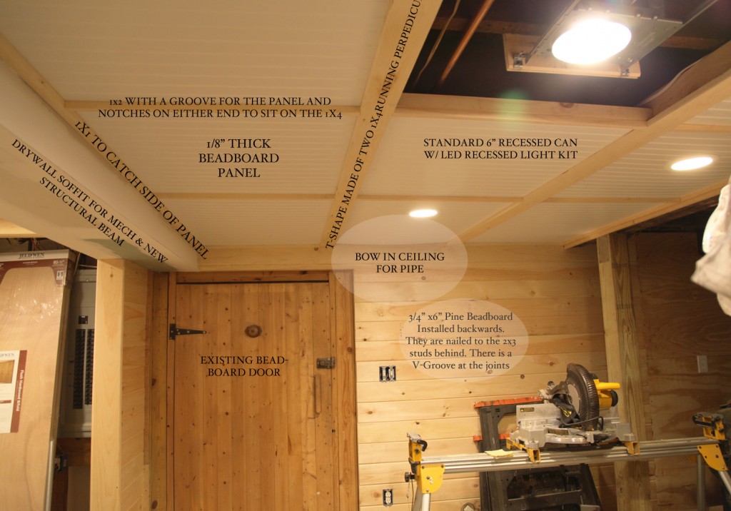
3. Ceiling Option 2: For our removable ceiling we want with a sheet product. This is about 1/8″ thick and is available in a 4’x8′ sheet and primed white. This is easy to work with and inexpensive. However because it is so thin it will tend to sag, so we had to be careful about not making the spacing too large. This also meant creating a “grid” out of wood for the panels to sit in. The nice thing about the thin panels is that it helped us maximize the ceiling height. We even bent one panel about 1/2″ to allow for an extra low pipe.

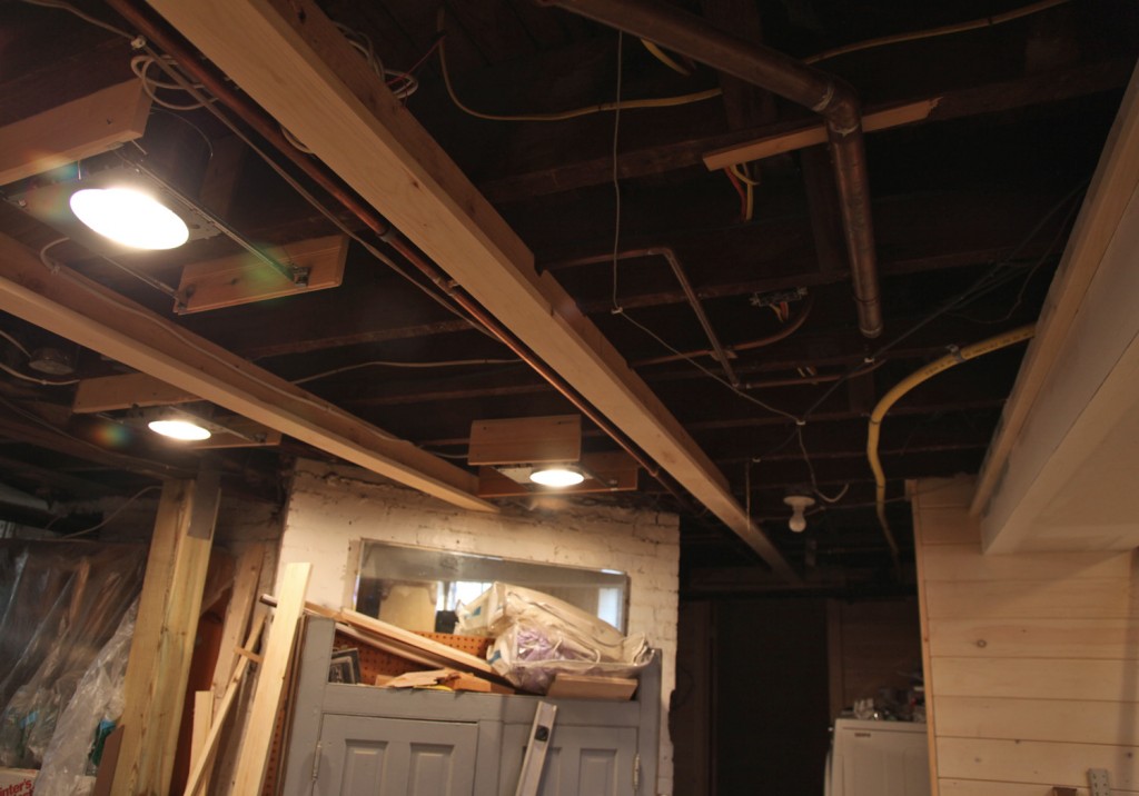
Ceiling w/ T-Shaped Pieces Installed

Step 1:We started by creating an upside down T shape out of 2 1×4 pieces and attaching them perpedicular to the floor joists above. This gave us enough space for the miscellaneous plumbing to fit.

Step 2: Rough in lights as required. We centered our in each “bay” of the ceiling. This took a lot of effort to come up with a pattern. Our ceiling was full of pipes and other obstructions (we are below the kitchen). I stood there for about a half hour with my contractor and a piece of paper trying to come up with an acceptable pattern.

Testing Panel Locations before Installing the Cross Piece

Step 3: Figure out the spacing on the panels and test fit.

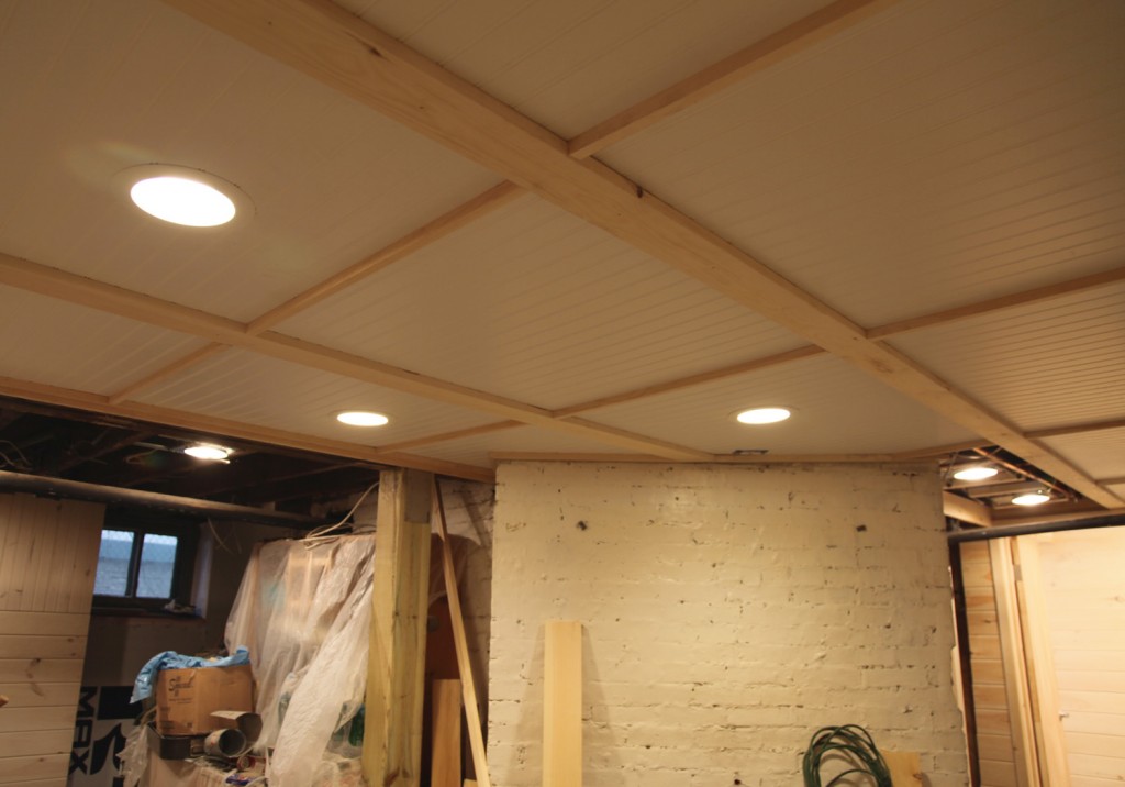
Step 4: Install the cross pieces. We used 1×2 with a groove cut for the panel and notches out on either side for them to sit on the 1x4s running the other way.

Ceiling Before Painting

Step 5: Install all of the panels. Because everything is pretty snug it definitely takes a little adjusting to get them into place. We installed the ones with lights first,since the trim piece goes over the panel.  I have to say that it is kind of pain to move them, but I don’t plan on doing it very often (maybe once a year to tops). The one advantage I do see is that if I get a leak above (i.e. the dishwasher) it would most likely only require taking 1 panel out.

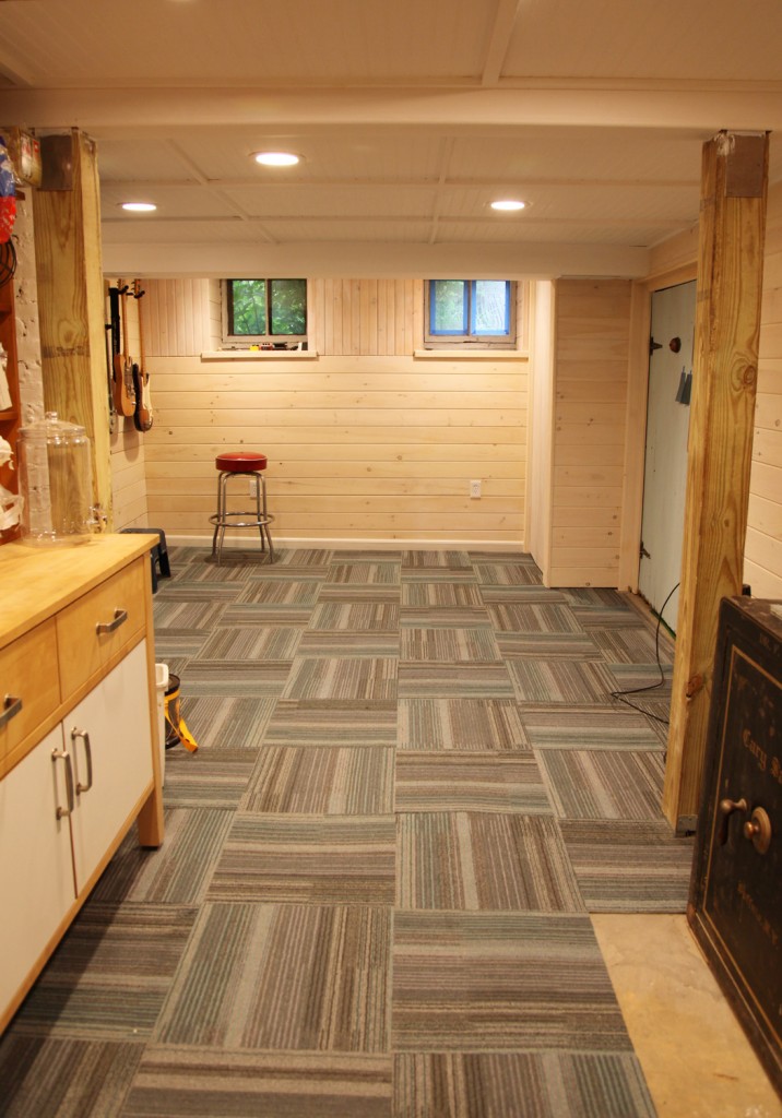
Finished Ceiling

Step 6: Paint. Okay so I should have painted the frame before putting the panels in, but I didn’t. Oh well. I really like how it came out.

Cost: I have also gotten several questions about cost. The materials themselves were not very expensive for this ceiling. Most of the cost is in the labor, for installing the upside down T-pieces (while dodging pipes), cutting the panels to fit and making the cross-pieces. It is also pretty slow going! If you are up for doing it yourself and you have the time, I think it is worth it. Paying for a contractor to do it, is definitely not cheap though.

More Questions? Just add a comment and I will do my best to answer them.

15 Comments

Sarah’s House Currently

I first spoke to Sarah about her front steps last year when we were working on her bathroom. She was looking for low maintenance, pretty front steps to replace her old steep concrete steps.  We then had a few discussions about her front yard and steps over the past year. We tend to have periodic discussions on and off about things before a decision is ultimately made, with some pinterest thrown in for good measure. Although once she makes up her mind, she is all in, which I really admire. Below are the main issues that needed to be addressed on the front of house to give it the curb appeal that it deserves.
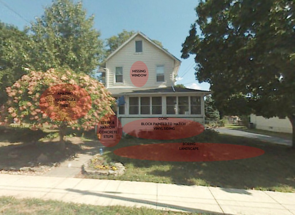
Sarah’s House before with Areas for Improvement

Areas for Improvement

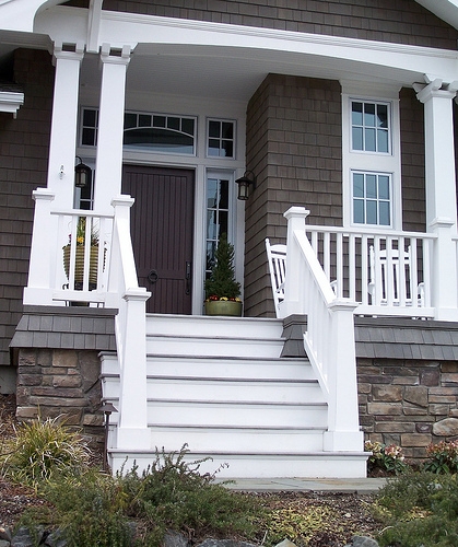
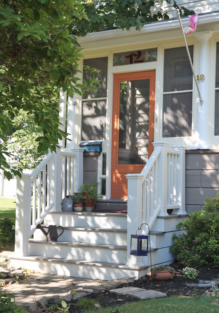
1. Front Steps: The old steps were not only not very attractive but they were also not very safe. She was looking for low maintenance. When we first talked she was thinking about slate. The problem with slate in this part of the country is that it needs to be resealed frequently and you can’t use salt on it. They are also quite expensive and require a lot of construction work and digging. Then we discussed more of a “porch” look but she didn’t want to be repainting it frequently. After several months the idea of trex decking came up. She liked that idea a lot. So I went to look for inspiration. Here is where I started:

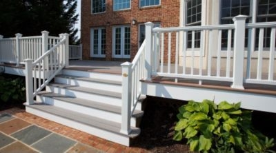
From Trex

Fortunately Trex and several of the other manufactured wood products have come a long way. They now offer railing options with hidden fasteners and nice detailing. It is not cheap, the material cost is 2-4 times the cost of wood, but it won’t require maintenance, which in a southern facing location like this would be frequent. Fortunately Sarah was looking for a simple gray flooring and white railing and vertical pieces, which are standard colors.

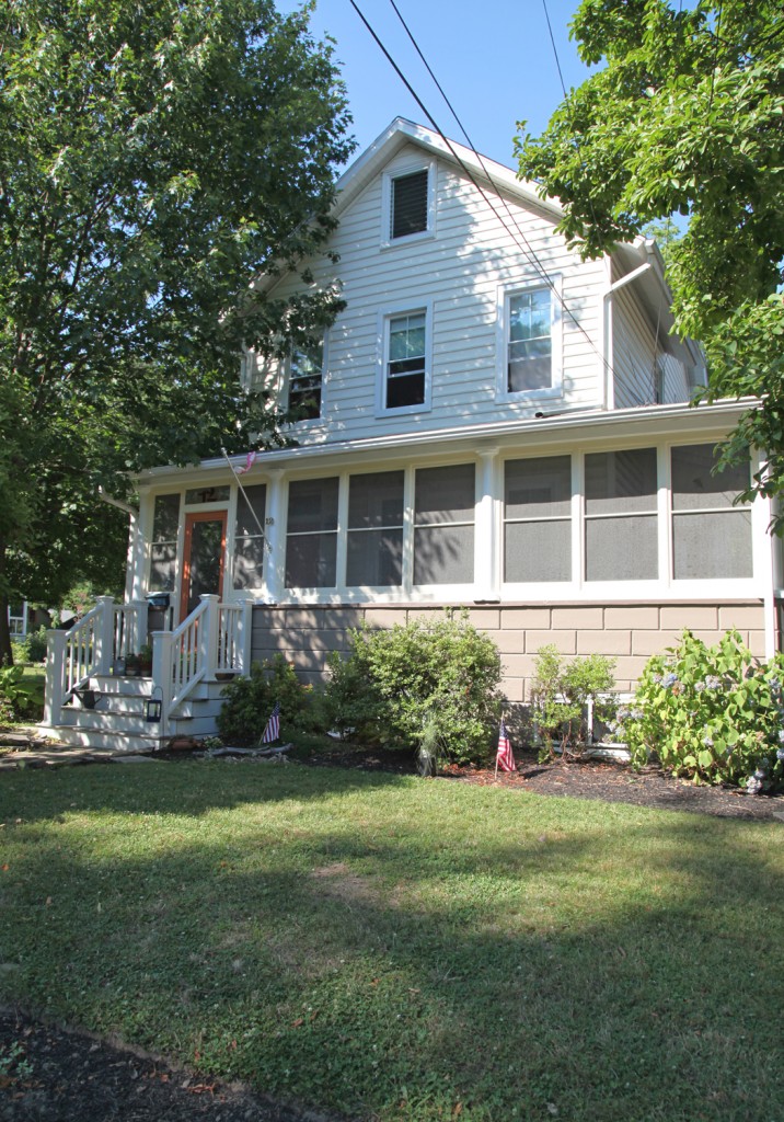
Sarah’s Front Porch

We designed the stairs to fit comfortably in board of the two adjacent columns. This gave enough space to have a comfortable landing along with space to accessorize. Fortunately Sarah was quick to add some lovely details like a couple of vintage watering cans and some bright annuals.

2 Paint: The house has lovely round columns, but they were in need of scraping, patching and paint. They were painted the same color as the surrounding trim, so they disappeared into the screened porch. Also the concrete block front 0n the existing porch was painted the same white as the columns and trim with a strange green stripe on top. I thought this brought too much attention to the block, which I wanted to be more recessive. Also a darker color would help ground the house, have it blend with the screens above and provide a better backdrop for the new plantings. The main body of the house has vinyl siding in a creamy white-yellow. It is fairly new (installed by the previous owner) and in good condition so it had to stay so the color palette had to work with it.

New Paint Color Scheme

The cream (Cream Puff from Behr was used on the columns) now works with a color palette that is more interesting and cohesive. The bright white adds a nice freshness, along with the light pumpkin colored door. Meanwhile the warm gray grounds the house just like I hoped. This will make a nice backdrop for the new plantings.

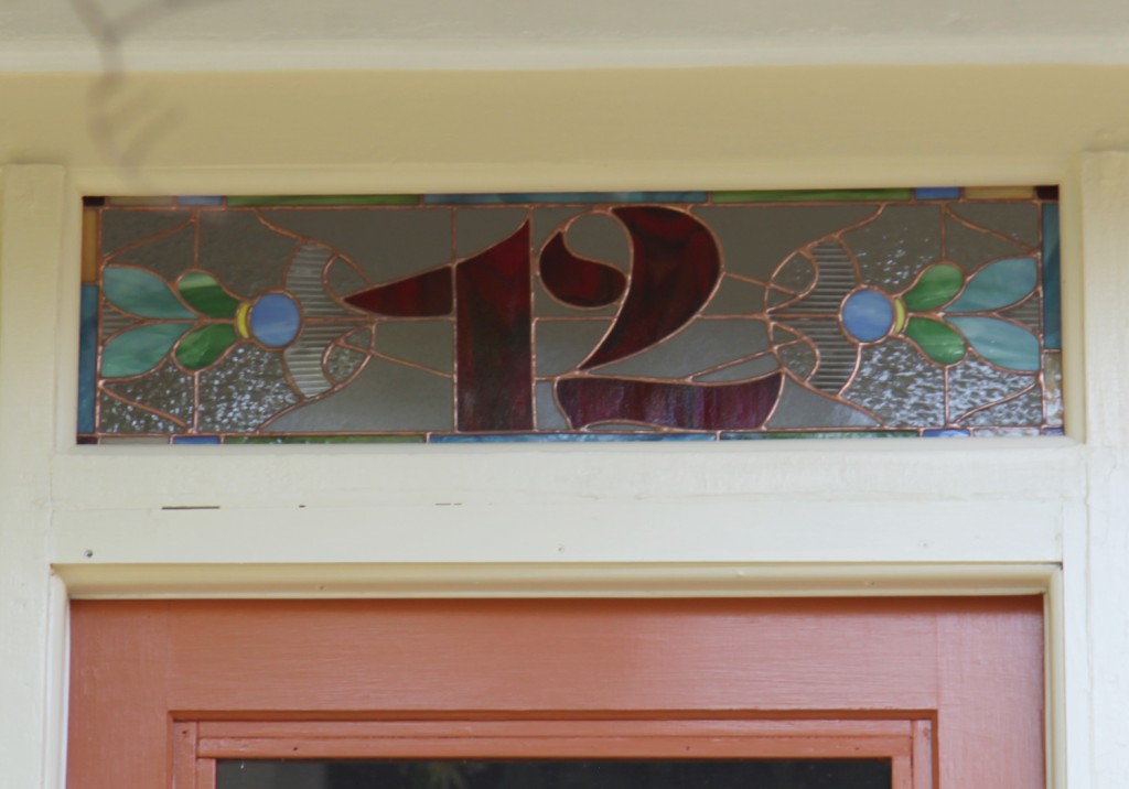
3. Windows: The previous owner added new vinyl siding over some old and dilapidated diamond asbestos shingles. This was an improvement, but installed less than ideal vinyl windows. Sarah has since replaced the windows that face the front with a higher quality window with historically accurate 2 over 1 pattern. While she was at it, she added the long missing middle window on the second floor. This made a major improvement to the front facade. She also had an artist design new stained glass numbers for above the door.

New Stained Glass Above the Door

I really like that the glass style has hints of Victorian but paired with a more modern font style.

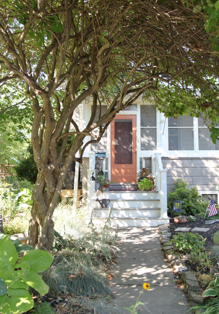
4. Plantings: Sarah has also been spending the summer slowly removing grass in the front yard to create a lovely cottage garden. She was fortunate to start off with a stunning hydrangea tree. It frames the front entrance and adds so much character. It has to be at least 40 years old.

Sarah’s New Front Entrance w/ Hydrangea Tree

She is infilling with a mix of classic cottage perennials such as hollyhocks, daisies and coneflowers. She is also mixing in some grasses, which give nice volume when the perennials are not in bloom. Her shade garden under her hydrangea also has a lovely mix of hostas, ferns and shade loving low grasses.

The curb appeal on her house has gone through the roof and I smile whenever I pull up.

I hope everyone has a great weekend and stays cool! We are not looking forward to the heat and will most likely be hiding inside.

Leave a comment

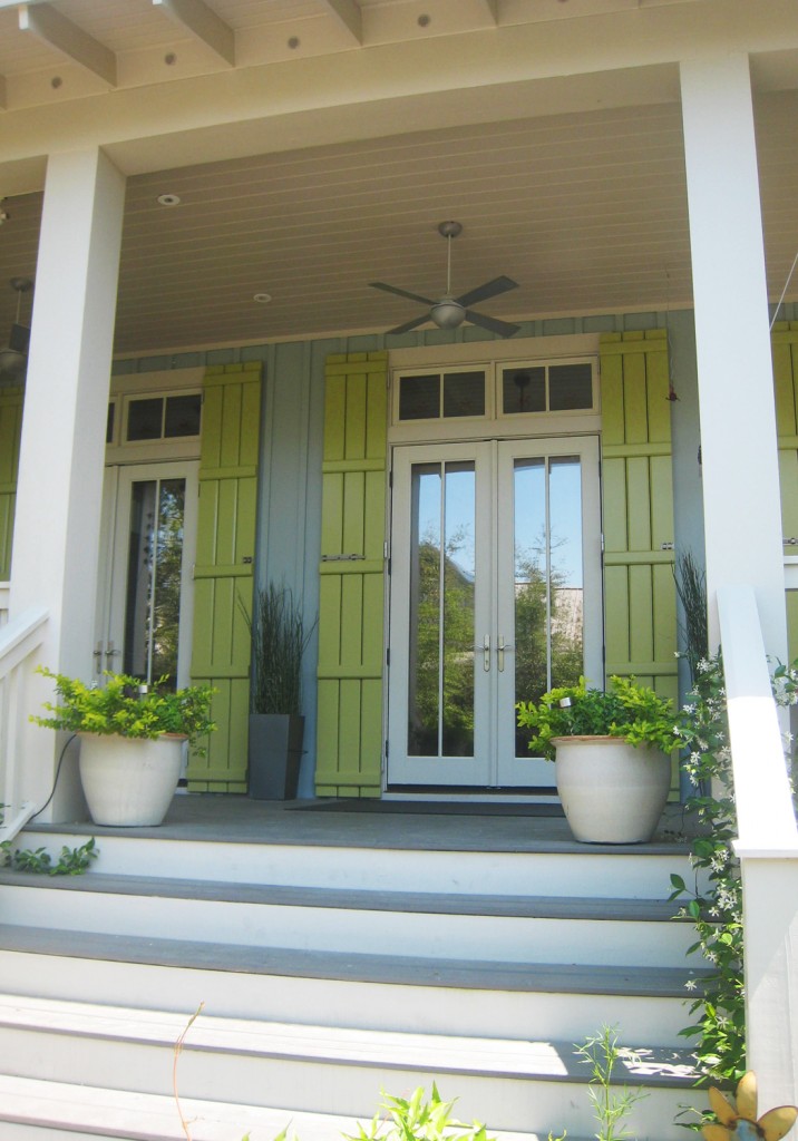
Blue-Gray Vertical Siding Paired with a Citrus Green Shutter and Creamy Trim

I have some new photos of Sarah’s new front steps and paint job to show off tomorrow, but before I do that I thought I would share some more cottage inspiration from our vacation to Seaside and Watercolor Florida (some of which I used for inspiration for her new front steps). So without further ado here is some more summer cottage inspiration. I think the one above is my favorite. The subtle blue-gray paired with the bright citrus green is really striking.

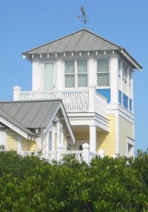
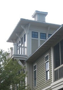
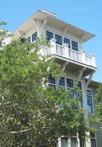
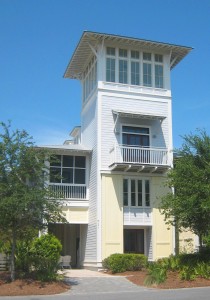
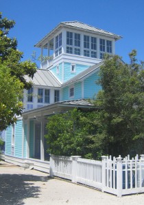
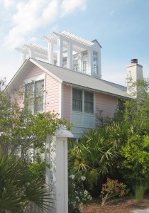
Cottage Towers

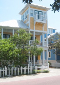
Yellow tower

Tower w/ balcony

Tower w/ balcony

4 Story Tower

Aqua Tower

Roof Trellis/Arbor

Seaside is famous for its new urbanist style and planning. Part of this plan included detailed guidelines for the houses. The guidelines actually encouraged interesting designs including the use of towers. These are a few of my favorites, but they are all over the small town.

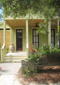
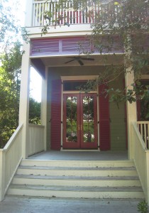
Porches

Yellow Cottage w/ Lime Green Shutters

Olive Green Cottage w/ Rasberry Shutters

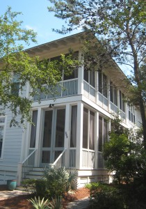
Two Story Screen Porch w/ gray-blue paint scheme

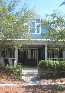
Symmetrical Cottage Porch w/ blue and white paint

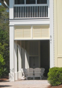
Nicest Carport Ever used as a Covered Patio

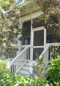
Screened-in Porch w/ Lush Landscape

These porches are so PRETTY! I can’t get enough of them! Of course I am bad about actually sitting on our nice porch. I think I need to make it more of a priority to sit on our porch swing.

I will leave you with this last one, another one of my favorites for its more rustic design.

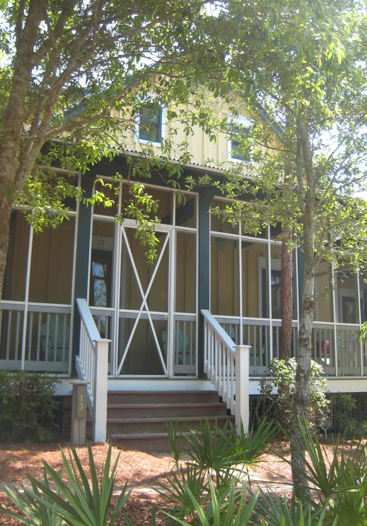
Nicely Detailed Screened-in Porch w/ yellow and green paint scheme and corrugated metal roof

For more cottage inspiration click here.

1 Comment

Beautiful Street in Seaside Florida

I just remembered that I had never posted up the cottage pictures that I took while on vacation of Seaside and Watercolor Florida. So in honor of summer I thought some lovely beach cottages were in order. Enjoy and stay cool!

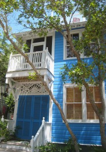
Bright Blue Cottage

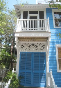
Love the Balcony & Woodwork

Yellow Cottage w/ Red Shutters

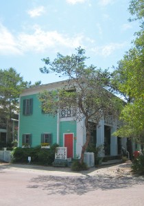
Mint Green Cottage

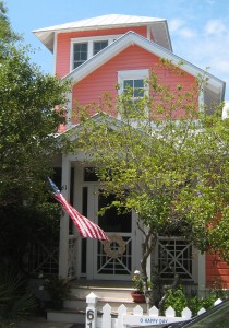
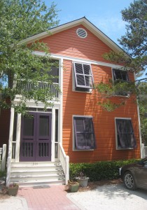
Pumpkin Colored Cottage

Beautiful Round Porch

Large Cottage w/ Cupola & Balcony

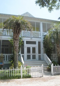
Yellow Cottage w/ Picket Fence and Porch

3 Story Yellow Tower

2 Story Screen Porch

Melon Colored Cottage

Towers of Seaside in distance with native plantings in foreground

I hope everyone has a lovely relaxed summer weekend.

2 Comments

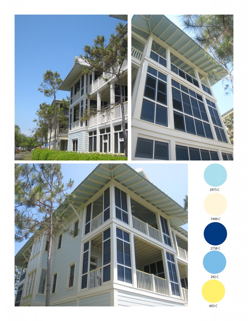
On our vacation one of the things that really caught my eye were some amazing exterior paint color schemes. So today I thought I would show you a couple of my favorites. Typically you would adjust these colors based on your climate. For example these colors are in full Florida sun, so in a cooler grayer climate you would tone them down accordinglt. I have listed the closest Pantone color for reference.

Color Scheme 1: Aqua w/ Cream Trim

Color Scheme 1 comes from the unit where we stayed.  The aqua color was really appealing with the cream trim, but what made it a little more unique was the dark blue (not quite navy) shutters and a hint of bright yellow (on the railings). There was also a slightly brighter cooler blue on the porch ceilings. Another interesting detail to note on this unit is the use of shutter panels to create privacy and hide elements that are not as attractive. They use these quite often down here to good effect.

Color Scheme 2: Yellow House w/ White Trim

Color Scheme 2 comes from a lovely cottage with a side porch. They yellow paint scheme is very friendly. The olive green shutters look nice against the yellow and again offer privacy from the street. The side porch was very popular in Savannah and Charleston back in the day. Here they have left it quite open and used a mix of gray, metallic and red accents.

Gotta run but I will be back later this week with some more color schemes.

Leave a comment

We had a lovely vacation on the Florida panhandle, but this morning was pretty painful, after a week off and an hour time change (okay, I will stop complaining now). I have a ton of pictures to go through but I thought I would start out with a few of my favorites from our trip. Seaside and Water Color Inn & Resort are filled with lovely white beaches with lots of picturesque cottages, all beautifully planned out in “perfect” little communities (Seaside was where they filmed “The Truman Show” after all) . I was ready to move in (except for the prices and that you are in the middle of nowhere). The kids had a great time making sandcastles, “swimming” (I mean floating around the pool on inner-tubes), fishing and kayaking.

Sam's Drawing of Our Trip including swimming pools, fish, a crab and him wearing goggles

I will be back later this week with some cottage pictures, details and paint colors to inspire.

1 Comment